Bedrooms

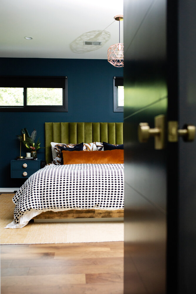
How to Make a Channel Tufted Headboard


How To Create A Channel Tufted Headboard

Get a Luxe Look For Less

Sometimes I get an idea in my head for a piece of furniture and I can't find it anywhere.  Or I find a picture of something similar, yet it's about 487 million dollars, and it turns out I only have 387 million dollars, so alas, I can't afford it.  

Green Velvet Headboard tutorial grand rapids interior designer.jpg

Life is hard.  Hashtag first world problems. 

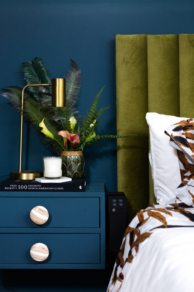
That is the story of this headboard.  It was almost four years ago, and I couldn't find a green velvet headboard ANYWHERE.

 It's one of the most commented on item when I post on instagram so I wanted to share how I made it. It's really easy.  If you read all the way down, you can see how I made it with NO SAWS or cutting items (because I don't do saws, because I like all my fingers). 

Green Velvet Channel Tufted Headboard tutorial DIY.jpg

(You can now find a green velvet headboard lots of places, but if you want a different more unique color- you’re gonna have to make it yourself)

Supplies Things You Need: 

  • Boards: Decide what width you want the channels to be, and how high of a headboard.  (If you want to be most cost conscious, do a headboard height that can be cut out of 8 or 12 feed boards evenly (so 4ft/6ft high), as opposed to picking a 5ft tall headboard and having a bunch of 3 ft left over scraps).  

  • batting (do not try to do it without the batting)

  • 2" foam

  • staple gun and LOTS of staples

  • french cleat 

  • 1x2" boards for back

  • drill 

  • screws

  • Fabric 

How To Steps

1.  Figure out how many boards you need.  I used 1x6's (which are really more like 1x5s) and needed 12 of them, and for our bedroom I needed them to 40” tall.  I went to Home Depot and had them cut the boards for me there.  The signs there say they charge for more than a few cuts, but I've never had an issue with being charged (and even if you are, it's like $0.25 a cut, which is a heck of a lot cheaper than a saw...also less chance of losing fingers)  I also got 1 x 2" cut long enough to go the width of the headboard

2. Next step- Measure out each piece of foam on a board and cut the foam into pieces.  You generally want to make sure the piece of foam is the same size as the board or slightly smaller, or you'll have some overhanging foam bulge (the technical term for it) and it could be more difficult to connect all channels together.  

DIY Channel TUfted green velvet headboard.jpg

3. Batting: you're going to need a piece of batting large enough to wrap each piece of foam and board.  Think about wrapping a present, Staple the crap out of the batting. 

DIY Channel Tuft Upholstered Headboard.jpg
DIY Channel Tuft Headboard.jpg

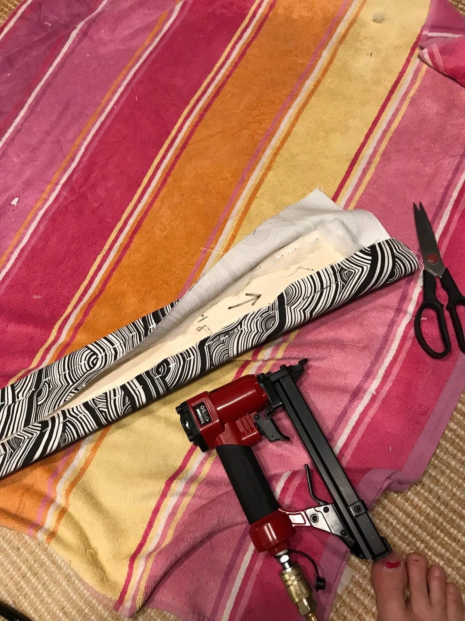
4. Fabric:  Once you've got each board wrapped with batting, cut fabric to size to cover each individual board (once again you want to wrap it like a present).  Flip the foam board covered with batting upside down on the fabric (so you can see the staples you just put in) and proceed to wrap board like a present.  Take care when folding the corners at the top, so they're flat and uniform on all the boards, because you'll be able to see them.  Staple away. 

How to make a channel Tufted Headboard.jpg

5.  Once you've got all the boards foamed, wrapped in batting and covered in fabric, line them up in the order you want them to be.  Then flip them fabric side down/staple side up on the floor.

DIY Channel Tuft Banquette Bench.jpg

6.  You might need help with this step- or you could use some heavy things to hold the boards together. 

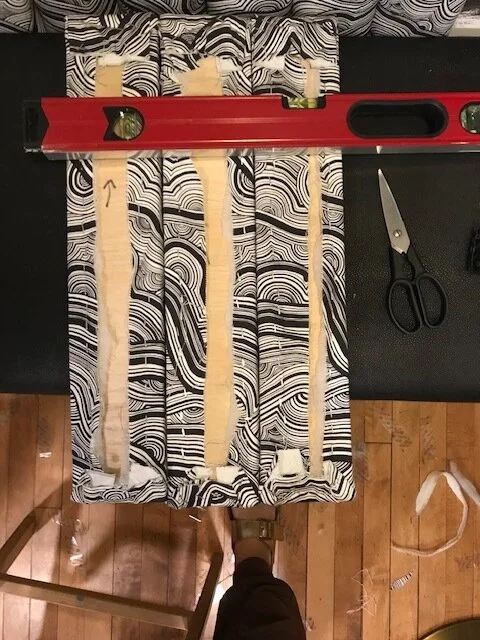
You want to take the 1x2's and place them on 2 sections of the headboard- their purpose is to hold all the boards together.  you want the highest one to be about 1/3 of the way down the headboard, and the second about 2/3 of the way down so they're placed evenly. (In the picture above, the level is to imitate how you would attach a 1x2 to the fabric wrapped pieces of wood).

Screw some long enough screws into the wood, so you can connect the two boards (you want the screws long enough to go into the second board and hold the two boards together, but not too long that it's going to poke out the foam in the front...Not a super comfy bed if a screw is hitting you in the head).  

7.  Attach the french cleat onto the back of top 1x2".   Attach other french cleat to wall (do some measuring first to make sure it's in the right spot, and make sure you're using a few studs.  (use a big french cleat with a high weight limit)

8.  Hang headboard on wall.  

9.  Go take a nap in your nice new bed.  

Green velvet channel tufted headboard DIY.jpg
DIY Chanel Tufted headboard green velvet headboard.jpg

(You’ll notice some of these pictures are from the channel tufted banquette we made recently- you can go to that post to see more info. Both the headboard and banquette were made with same method, but I lost the pictures from when I made the headboard)

Green Velvet Headboard DIY Mid century bedroom.jpg

Let me know if you have any questions!


Small House? 5 Tips to Design Your House and Keep You Content


Small House? 5 Tips to Design Your House and Keep You Content

How We Designed a Small Shared Girls Room

Small rooms and small houses are some of the hardest spaces to design well. You have to fit a certain amount of necessary furniture in them, while also wanting to make the space feel like ‘you’.

monochromatic shared nursery how to design small spaces grand rapids interior designer.jpg

It really forces you to get creative, not only with furniture layout, but with the color scheme because it is VERY easy to think you’ve just got a few things going on, and then WHOA, overload and it all makes the room look smaller. 

Tips On How To Design A Small Room

-       Don’t be afraid of dark colors.  The color of the room matters less than how many colors/items are in the room.  You can paint a room dark if you are going monochromatic and the other items in the room blend in with the walls.  (The only reason we didn’t go dark in this girls room was because we went super dark in the bedroom next door and wanted something different)

-        Don’t be afraid to paint the ceiling dark (it makes the ceiling recess and makes the space seem larger

-        Use Mirrors.  They will reflect the light and the space giving the impression of a larger space.

-        Keep the floor uncluttered.  Use a sconce or table lamp instead of a floor lamp.  If you can, use floating pieces of furniture that give more space.  Use unused space under a bunk bed for a crib or toy storage

-        Don’t forget lighting.  In this particular room, the ceiling pendant light and the table lamp give off enough light, even though it is a dark room with a north facing window-  but if you had a slightly larger room, you would probably also want some can lights in the ceiling to brighten the space up.

-        Don’t buy a tiny rug.  Buy the largest rug that will fit in the space.  Small rugs make a space seem even smaller.  In this room, we only had room for a 4x6.  If you are decorating a living room, I can guarantee a 4x6 will be too small…unless you are a tiny person and your couch is 2 feet long.   

girlsbedroom.whiteeamsrocker.grandrapidsinterior.design.whitepouf - Copy - Copy.jpg

This shared girls room project in Grand Rapids Michigan, is one of the harder spaces I’ve designed because it is SOO small.  Per code, a bedroom has to be wider than 7 feet.  And this bedroom is like 7.5 feet. 

Prior to experiencing the space, I designed a moodboard for the room- based off of some items I already owned and liked.  I love lots of color, and wanted to incorporate color into the room. 

Shared girls room design board colorful bright.JPG

Turns out the final result was exactly opposite of lots of color, yet it was one of my favorite rooms in the whole house.

First mistake in this was painting the ikea kura bed black.  In a larger room, this would’ve looked great still- if the bed was less bulky, and more spindly like a jenny lind bed,(like the crib in the pic) I still think it would look great and not too overwhelming and dark. 

Colorful and bright shared girls room design.JPG

With just too much color and too many things sticking out and the room closing in and feeling smaller, I decided to go mostly monochromatic and use pattern and texture to make the room interesting. 

girlsbedroom.bookcase.grandrapidsmi - Copy.jpg

I had always loved this wallpaper from Hygge & West- I had contemplating using the blue version on the back of our kitchen island, (and then didn’t since I decided to do an extra row of cabinets for storage), and thought about using the black and white version in our tv room (but didn’t because wasn’t the vibe I was going for), so when I remembered they had a white and gold version I felt like I had cured cancer.  (turns out figuring out a design conundrum doesn’t save any lives, but I’m not going to let that rain on my parade). 

monochromatic girls room design grand rapids interior designer (1).JPG

With that figured out, this is the moodboard I came up with.  I wanted to accent with a little wood to bring a little something besides white- also to complement the wood pendant light and wood floor. 

We already owned the white eames rocker and and the gold/wood circular table(which also is tub, so it doubles as the girls costume storage). 

I bought a low white bunk bed from wayfair, and the cheapest white crib from ikea.  We cut off the legs off the ikea crib so we could slide it under the bunk bed and voila! Two kids fit in an extremely small, space. 

whitegirlsbedroom.woodlightpendant.grandrapids - Copy.jpg

I choose a lucite bookshelf from CB2 for their books so it would blend into the wall and not stick out like a sore thumb-bonus is in another house, I can use this in an adult space.  You could have the same effect by painting a bookshelf or dresser the same exact color as the wall.  It will blend into the wall and make the space seem bigger. 

2.white.girls.bedroom.grandrapids.michigan - Copy - Copy.jpg

What are your thoughts? Did you ever think you could have a functional room this small?


Shared Girls Room Reveal


Shared Girls Room Reveal

Welcome to the reveal of one of my favorite rooms in our house.

1.white.girls.bedroom.grandrapids.interiordesign - Copy - Copy.jpg

It caused some of the most headache design wise because it was soooo small…it’s a classic case of “when at first you don’t succeed and everything looks crappy”.

This was the room we started with before we moved in.  And then we made it a smidge smaller (so we could have a bigger closet in the master bedroom…because parents pay the bills and thus always get priority).

IMG_9613.jpg

Below is the room after renovation, with a hodge podge of items that I already owned.  I still love the curtains, and hope to use them in a different room someday.

IMG_9608.jpg

 That bed was a disaster DIY project.  I was pregnant with #2 and too lazy to refinish it the correct way, so I ended up having to refinish it multiple times and still didn’t like it, so I sold it on craiglist and bought a white bunk bed.

Originally I was going to try to use some of the items we already owned and created these two mood boards which look good in theory, but not in real life for a room this size.

IMG_9611.jpg
IMG_9612.jpg

After deciding we needed to go in a fun monochromatic direction, I came up with this mood board….the wallpaper had always been a favorite and I had contemplating using it in other colors in other areas, but the gold on white was perfect for this room.

Moodboard.girlsbedroom.allwhite monochromatic

The wallpaper is Underwater World by Hygge & West in the white & gold.  The white bunk bed is from Wayfair and the crib is from Ikea.  (we shortened the crib legs so it could fit under the bunk bed) (I didn’t want a tall bunk bed for my 5 year old, so sawing the crib legs was the safer way to go). 

We measured and shortened legs BEFORE we put crib together, which was easier, but somewhat of an oopsie, because with the crib mattress at the lowest point, there is a bolt that sticks down past the crib leg (see pic), There was no way to really know this ahead of time.  We’ve fixed the issue by putting the crib on some furniture sliders, so it lifts it up slightly so bolt doesn’t dig into our wood floors.  This also makes it easier to slide the crib out if we need to put in a sleeping two year old. 

The dresser we already owned- it was a craigslist find that I had refinished back in 2013.  I still like it, but am contemplating selling it or refinishing it again. 

6.whitegirlsbedroom.woodlightpendant.grandrapids - Copy.jpg

We already owned the white eames rocker (a reproduction we bought from amazon), and the gold table/stool from target.  The stool doubles as storage- our girls keep their dress up clothes and costumes in there, so it’s easy to pick up after play time. (The stool was from Target, but I don’t think they sell it anymore)

The white driftwood lamp, we got from an old garage sale years ago.  I painted it white to blend in.  The light fixture is from etsy, and if you look close you can see hearts on it.  It was my own attempt at being slightly cheesy, as my oldest girl only has a half a heart and has had a bunch of heart surgeries (strangely enough, the etsy shop did not sell light fixtures with half hearts, so we adapted).

5.girlsbedroom.whiteeamsrocker.grandrapidsinterior.design.whitepouf - Copy - Copy.jpg

The lucite bookshelf is from Cb2 and since it’s clear, gives the visual impression of more room in this tiny room.  Also bonus it doesn’t look like it belongs in a kid room, so is more versatile down the road. (I would’ve never spent that much for it for a kids room, if I wasn’t planning on using is somewhere else in our next house).

The shaggy rug is a less than $100 find from rugs usa.  It’s so soft and great, and held up wonderfully for a few years until our youngest daughter puked in it during a particularly nasty bout of noro virus…those were fun times.(I’ve recently learned they don’t sell it anymore- but I’ve had good luck with their rugs!) 

I debated for a long time on what to do for artwork and wall décor, but settled on super simple, because I didn’t want to take away from the wallpaper.  Just a few simple family pics and a boho macramé thing from world market. 

The curtain rods were a DIY thing, and the white curtains are a $10 Ikea special.

3.brown.white.dresser.grandrapids.mi.interiordesign. - Copy - Copy.jpg

The window trim is painted Sherwin Williams Tricorn Black.  (this is the best black ever- such a true black without undertones of different colors).  (see our post here to get pics of all the places we used tricorn black in this project). 

And there you have it- the details on everything behind our shared girls room in our East Grand Rapids Sunset Lake Blvd project!