Interior Design

Modern Vintage Kitchen Makeover Fall ORC: Week Three


Week Three ORC: Fall 2020

We are at the halfway point of the One Room Challenge and I’m ready for a vacation. (To see previous weeks, click below)

Week One I Week Two

Okay, I was a ready for a vacation prior to the start of this. But now I’m extra ready.

My husband is as well. He’s making a dent on this bottle. But really I wanted you to see a close up of the new tile.

My husband is as well. He’s making a dent on this bottle. But really I wanted you to see a close up of the new tile.

The crazy part thing is, that it’s going to be way busier the last few weeks because we’ve done almost everything we can do until our windows go in on Nov 2/3rd. Then it’s going to be a race to finish everything in time for the end of the challenge.

Not to be all cynical, but I honestly don’t know if we’ll make it for the initial “reveal” date of Nov 12th. (but technically we have an extra grace week, but my husband doesn’t know that and he doesn’t read my blog, so don’t tell him!)

So! What we’ve been doing in the past week!

The husband has been hard at work doing the tile backsplash in the kitchen.

All of you who think he’s just the best husband ever to do all my dirty work….not only does he get paid in sex as I mentioned last week, but the real reason he’s been working so hard is so he can go on a climbing trip this weekend with his friends.

Sex as payment was a distant 2nd place prize when compared to a climbing trip. So, don’t you be feeling bad for him.

Black square zellige kitchen tile backsplash modern vintage kitchen grand rapids interior designer.jpg

We’ve done as much tile as we can do until the window on the right side of the wall is removed and drywalled over.

We’ve come across a little snag in this tile job as the ceilings in our 100 year old house are extremely out of line….to the tune of 3/4” unlevel in only a span of 5 feet of ceiling. We’re going to have to get creative how we address the top 6” of space for tile.

But creativity is the name of the game around here. Sadly, I might have to do dark grout instead of light grout like I was planning. The white will only high light all of the level issues…we shall see!

black square zellige tile kitchen backsplash yellow lower cabinets DIY painting kitchen cabinets.jpg

I’ve started the painting process for the cabinets. Stay tuned for a cabinet painting tutorial.

I hate hate hate the sanding and prep process. I managed a crystal glass finish on the table I painted for the spring ORC, so fingers crossed I can do the same for the cabinets.

Painting kitchen cabinets DIY interior design.jpg

I’ve also got the bottom part of the wall under the chair rail painted with a winning color. (Which is black…what a shocking surprise coming from me, I know.)

I really tried to do something different but I am not cool enough to pull it off.

Originally, when the cabinets were going to be green, I was going to do the lower section a shade of green different than cabinets. But then I changed to yellow cabinets and I definitely didn’t want to do the lower wall yellow.

Benjamin Moore Bayshore Beige.jpg

So I picked out a color from the wallpaper and got some samples with ‘beige’ in the title and thought that I was going to bring back beige.

Newsflash. I will not be bringing back beige. That will have to be someone else’s job. It could’ve worked if the floors were very dark, almost black or a gray. Definitely did not work with my floors.

Sherwin Williams Black Magic Matte Paint color.jpg

So I went with what I knew…which conveniently was in my basement, and that was Sherwin Williams Black Magic (the same color as the exterior of our last house).

The color makes my heart happy, which says a little something about the color of my heart. (I got real excited about the addition of the black heart emoji on my phone).

Doesn’t it make you feel better too?

Stay tuned! We have all of this coming up!

Still to do:

  • Banquette bench installation

  • upholster bench

  • paint bench

  • new windows

  • Tile over old window location

  • hang open shelving

  • wallpaper.

ORC.Logo.jpeg

To follow along with all of the other guest participants doing the One Room Challenge, click here.

The featured designers are doing some pretty cool virtual stuff here!


Fall 2020 ORC Week Two: Modern Vintage Kitchen


Fall 2020 ORC Week Two: Modern Vintage Kitchen

It’s only week two of the One Room Challenge and my husband is already wishing his covid-related paid leave from the airlines was over.

ORC.Logo.jpeg

He was living his best life this summer…road tripping…vacationing…and then we got home and he became my tile guy. And my electrician. And my plumber. And my carpenter.

Despite being paid in sex, he still thinks he’s grossly underpaid…especially when it comes to dealing with dark grout.

In case you are just joining….The One Room Challenge is a Bi-annual event hosted by Linda from Calling it Home and Better Homes and Gardens (thank you guys!) Designers from around the country/globe have 6 weeks to transform a room…documenting the whole process.

To see our design plans and all the before pictures, see our Week One post here.

Background on Design

I forgot to mention last week - While we own this house, we aren’t planning on staying in it forever, and will probably rent it out in the next few years. Hence, we are trying to update the spaces without ripping everything out, because A) that’s a lot of money & B) the kitchen is brand new…so it seems pretty wasteful.

grand rapids interior designer one room challenge white square subway tile black grout.jpg

Update

We got a lot done this week (by we I mean the husband, the tile guy).

The half bath off the kitchen is almost done…..still waiting for some wallpaper to go up in there and I want to paint the faucet, but may not because I’m lazy.

The husband has spent the last week tiling the floors and walls of the bath- he’s just putting the sink and toilet back in place as I type. Fingers crossed the toilet doesn’t leak.

“Whose idea was it to do black grout? I would charge 3 times as much to do this. This is ridiculous.” he complains.

The husband is not a fan of my design asks.

grand rapids interior designer one room challenge white square subway tile black grout (2).JPG

The cutest tile guy in the world right here. He just wants to play with all the sharp tools…he’s never happier than when walking around with something that could dismember him or poke out his eye.

Sooooooo….about those design plans I mentioned the first week? The whole “painting the kitchen cabinets green,” thing? Well, I got a bunch of samples…and while I absolutely loved every shade of green I picked out…I didn’t love it in the space.

One room challenge green cabinet kitchen makeover.jpg

Sooooo….I did a 180 degrees and decided to go the yellowish-gold route for the lower kitchen cabinets.

The trick is the floor which has yellow/orange/honey tones in it and I don’t want the cabinets to be an extension of the floor. So I got the wallpaper out, my paint decks and went to town.

yellow floral wallpaper yellow kitchen cabinets one room challenge grand rapids interior designer.jpg

And then I picked up 49 yellow paint samples to try to get an idea of which route I wanted to go. I’m pretty sure the paint store people thought I was nuts.

And they wouldn’t be entirely wrong.

Mustard Yellow paint colors Benjamin Moore Rennaisance Gold.JPG

I very easily cut 4 of the colors out of the running, and kept two in my kitchen for the last 5 days staring at them morning and night and deciding which I liked better.

After painting the top two contenders on some large cardboard and keeping those in the kitchen, I decided to go with the darker yellow on the right- Benjamin Moore Renaissance Gold.

Painting kitchen cabinets yellow Benjamin Moore Renaissance gold 280 Benjamin Moore Hollywood Gold 279.JPG

The yellow on the left is Benjamin Moore Hollywood Gold, and I liked the name of that one better…but alas, I’m not a hollywood girl so it only makes sense.

What are your thoughts? Are you disappointed I didn’t stick with the green?

Stay Tuned next week for week 3 of the One Room Challenge.

Don’t forget to check out all the featured designers and the other guest designers and see some really cool fun stuff!


Modern Vintage Kitchen Makeover: Fall 2020 One Room Challenge


Modern Vintage Kitchen Makeover: Fall 2020 One Room Challenge

It’s here. The Fall One Room Challenge.

Is here.

ORC.Logo.jpeg

And as I sit and type, I can’t help but think, “OH MY GOODNESS WHAT AM I DOING SIGNING UP FOR THIS I’M TOO BUSY!”

But, the best way to get something finished is tell a few thousand of your friends you’re gonna do something and then you have to finish it, because if you don’t they’ll throw eggs at you and call you a liar. (okay maybe not the eggs…but you see my point).

If you were around this spring, you’ll know that we just moved into a new house, and we did our living and dining room for the spring ORC. It was my first time ever participating and I had a lot of fun.

black tile kitchen yellow floral wallpaper.jpg
Black tile vintage modern kitchen makeover.1.png

And I’ve got a kitchen that needs some flair (and more importantly, some more storage and functionality). So here we are trying to make this very very small kitchen in our very, old, house work for our boisterous family of 5.

Oh, also?

Because I don’t know the definition of “one”, I added on the half bath and the mudroom. So here we are…starting the Three Room Challenge.

Black tile vintage modern kitchen makeover.png

Honestly, the kitchen isn’t bad…it was replaced before we moved in due to a kitchen fire, and they could’ve done MUCH MUCH worse.

But it is extremely boring and extremely gray (just like the rest of the house was) and needed help.

2020.10.ORC.blacktilefloralwallpaper.modernvintage.kitchen.tuliptable.pptx.jpg

So we’ve got some plans…we are gonna tile, built a banquette bench (with storage, yay!), and of course I found a super fun floral wallpaper which will pretty much ensure my husband will never, ever, say the words, “I don’t care what you do to this house” to me again.

Because I’m nice and thoughtful, and sometimes like to give my guests eyes a break from color, the bathroom is going to be plain ol’ black and white.

The worlds tiniest bathroom.

The worlds tiniest bathroom.

I didn’t really feel like spending a lot of money on the bathroom, so I am re-using leftover black hex tile from a previous project for the floor and some leftover square subway tile for the walls. My big splurge is the wallpaper. (YES! MORE WALLPAPER!)

2020.10.ORC.bathroom.jpg

Last, but not least is this mudroom that is attached to the kitchen. Once I realized I knew the contractors who would be putting in our new windows (we have original 100yo windows), I asked them to take down this barn wood wall (sacrilege, I know), take out the window, and install some floor to ceiling Ikea cabinets.

CAN WE SAY MORE STORAGE??!

IMG_2454.jpg

Follow along via Instagram and my blog to see how it all pans out and see if the husband does a better job tiling than I did this spring.

To see all 20 featured designers- click here

To see all of the guest designers- Click here

Thank you to Linda of Calling it Home & Better Homes and Gardens for hosting this!


One Room Challenge Reveal!!!

Swatts & Co Living and Dining Room: ORC Reveal!!

Finally. Wow. Not gonna lie, I didn’t really think finishing one (or two) rooms in 6-8 weeks was going to be a challenge. And I suppose it wouldn’t be if I didn’t have a job, or kids, or hadn’t just moved into a new house, etc. But therein lies the challenge.

IMG_0003.jpg
Thank you to Linda Weinstein and Better Homes and Garden for Hosting sponsoring this event every year!!

Thank you to Linda Weinstein and Better Homes and Garden for Hosting sponsoring this event every year!!

IMG_9760.jpg

Because of Covid and not being able to have any trades in the house, I learned a lot during this time period: how to tile, how to wallpaper over surfaces that shouldn’t be wallpapered, and that sometimes you don’t know what you want until you get it.

Remember the ‘before’ pictures? Do you remember the ‘before’ story? How this was our Plan E house, and we ended up here because of the pandemic and we weren’t going to stay very long because it was a bit smaller than we wanted(and I have to share a bathroom with my 3 children)?

1 Blue room regatta Sherwin Williams black and white curtains silver metallic brick fireplace blue white modern penny tile design eames chair by fireplace.jpg
SusannahWatts_web-19.jpg
17 george washington portrait on a red horse.jpg

It’s amazing how finishing just two rooms of your house makes you rethink all of that. I’m now in love with the house, the size, and the neighborhood and don’t plan to leave anytime soon.

When I started this I didn’t really have a plan except I knew I wanted to be able to re-use as much of our furniture and décor as possible, use red & blue as the main colors, and I wanted it to be the opposite of minimalism.

regatta sherwin Williams mid century modern light built in bookcase red wallpaper.jpg

Those arched bookshelves were my starting point.  I found that pink/red palm wallpaper and immediately knew were I was going to put it.  Pretty much everything else was judged by the ‘will it work with the wallpaper?’ question because there was no way I wasn’t using it.

I painted the bookshelves and cabinet doors the same color/sheen as the walls (Regatta by SW) to make it blend in better. I contemplated painting the wood trim blue as well, but didn’t because:

  1. I am very very lazy and I hate painting trim.

  2. Painting original wood trim in a hundred year old house is a very serious polarizing issue somewhat akin to discussing politics and religion and I just didn’t want to go there.

  3. See number 1

13 blue velvet couch modern art on blue wall regatta sherwin williams pierre frey curtains blue table.jpg
9 Blue room regatta Sherwin Williams black and white curtains silver metallic brick fireplace blue white modern penny tile design eames chair by fireplace.jpg
7 Blue velvet couch modern art blue walls regatta sherwin williams bar cart as end table.jpg

My absolute favorite part of this room is everything to do with the fireplace and these wall sconces.

I knew I was going to paint the fireplace, but I wanted to do something different, and no ‘normal’ colors seemed like a good choice. I remembered that I had a can of silver metallic paint left over from a project 6 years ago, which brought me back to the “use what I already” have goal. I painted that fireplace silver and never looked back.

If I’m honest, I’ll say that I was a little nervous about this fireplace. When you can’t find any inspo pics online there’s 1 of 2 reasons for that.

  1. No one else has done it and taken pictures

  2. It’s not a good idea and it hasn’t been done and photographed because it’s gonna look awful

But the biggest rewards come from the risks and that little nervous feeling in your stomach.

9 Blue room regatta Sherwin Williams black and white curtains silver metallic brick fireplace blue white modern penny tile design eames chair by fireplace.jpg

The tile was my very first tile job ever and I should admit I’ve been patting myself on the back ever since(humbleness is not a fault of mine…). My husband, the perfectionist, couldn’t even find many things to critique, so we know we’ve got a winner.

We did pretty well using what we had for this room.

  • Couch: prior LR

  • Eames Chair: prior reading area

  • White chair: from master bedroom

  • Rug: from prior master bedroom

  • Bar Cart: From prior dining room

  • Lucite shelving: from girls bedroom

  • Black/White end table: from prior reading area.

So all we needed was some paint, light fixtures, curtains, end tables, art and a fireplace makeover.

No big deal, right? So much of a “no big deal” I decided I also needed to do the dining room at the same time. So much of a “no big deal” I almost didn’t finish either room in time, and was literally finishing finishing and hanging the art an hour before the photographer came.

24 Blue  laquer table with black cesca chairs bubble chandelier blue modern art.jpg
white tiled buffet media console style modern art  (3).jpg

Our table from the old house was too big to fit into this space, so we put it in the basement and I found this table on FB marketplace for $40 and spent about 17 hours sanding it and 17 minutes painting it.(I exaggerate, but you get the point.)

blue laquer table black cesca chairs red pierre frey curtains.jpg

The large blue art is a cyanotype (a process using a photo negative, chemicals, and the sun to create the print) and I picked up the blue and red lady from a street artist in Greece last year. The artist told me she is a “Greek Mary Poppins”.

The tiled buffet is something I designed for our last house and is an Ikea hack that used to house my kids toys, and now houses our bar glasses and booze(I do believe the buffet is happier now, if not a little more tipsy).

white tiled buffet media console style modern art  (2).jpg
33 Blue  laquer table with black cesca chairs bubble chandelier blue modern art red pierre frey curtains.jpg

I repainted the legs BM Snow Cone Green, for a fun pop of non-traditional color. This color was our old front door color and I’ve committed to using it in some way or another in every home we live in.

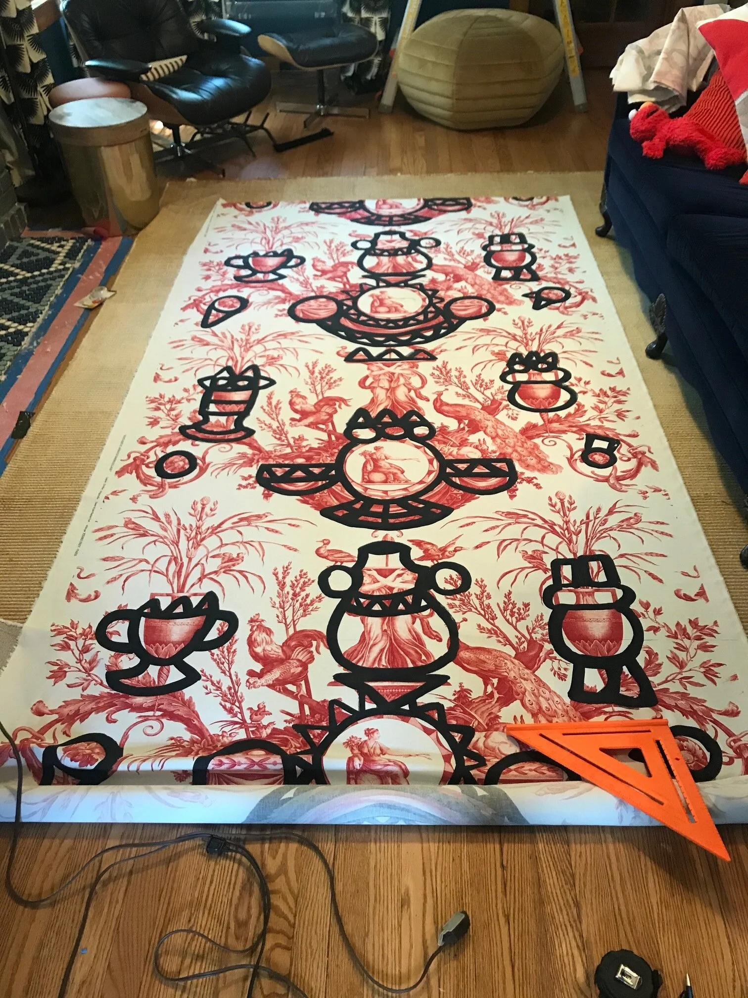
And the curtains…..ahhh, the curtains. They’re from Pierre Frey and I made them myself (once again, covid). Probably the only Pierre Frey curtains to be put together with hemming tape.

31  Blue  laquer table with black cesca chairs bubble chandelier blue modern art red pierre frey curtains.jpg
3 Blue room regatta Sherwin Williams black and white curtains silver metallic brick fireplace blue white modern penny tile design eames chair by fireplace.jpg
 
17.5 leopard styling plant shelfie.jpg
28.5  Blue  laquer table with black cesca chairs bubble chandelier blue modern art.jpg
22.5 Blue room regatta Sherwin Williams black gold flower wall sconce modern.jpg
14 Blue room regatta Sherwin Williams black and white curtains blue velvet couch built in bookcase with red palm wallpaper.jpg
32  Blue  laquer table with black cesca chairs bubble chandelier blue modern art red pierre frey curtains.jpg

Because art is the frosting of design, I left that for last. So yummy and so very necessary.

If you follow my Ig stories, you’ll know I painted the black & white modern piece myself. George and his horse was inspired by an amazing piece of art I came across earlier this year that had Napoleon on a red horse with some other graffiti.

Despite how important I think art is, $6k for one piece wasn’t really in our budget, so I found an $88 portrait of GW online and went to town with paint and and my kids crayons(and maybe a little Snow Cone Green on the paintings edges because I couldn’t stop myself).

12-blue velvet couch with modern black and white end table styling.jpg
4 Blue-room-regatta-Sherwin-Williams-black-and-white-curtains-silver-metallic-brick-fireplace-blue-white-modern-penny-tile-design-eames-chair-by-fireplace.jpg

Also, you can never go wrong with flamingos, so I added some, because, why not? Can you find them?

Thank you so much for following along on this journey with me. There were times when I was really tired and I totally wanted to quit and just finish it later. But I am SO happy I kept on going and finished it, because when we get home from our 6 week road trip, I’m going to be returning to a somewhat finished house.

If you want to learn more about me and Swatts & Co, click here.

Swatts & Co Grand Rapids Interior Designer Built in blue bookcase.jpg

Thank you to Linda Weinstein and Better Homes and Gardens for sponsoring this event. It was really fun to be able to participate for the first (and hopefully the amnesia will kick in, so it won’t be the last) time.

Also, thank you to Dionel Fisher of The Mittentog for taking all of these great pictures!

If you guys are looking for more design inspiration, head to the One Room Challenge Blog and prepare to get lost in Design Wonderland.

To see the progress on this room click below:

Week One I Week Two I Week Three I Week Four I Week Five & Six I Week Seven

The Fireplace Tile Challenge: One Room Challenge Week 7.


The Fireplace Tile Challenge: One Room Challenge Week 7.

Wow, here we are and the one room challenge is almost done.

(To see where we started, click here: Week One, Week Two, Week Three, Week Four, Week Six)

I saved the best and hardest project for last…not gonna lie, I was pretty nervous to do this one on my own. Per my husband, he didn’t doubt my abilities at designing the fireplace tile, but he severely doubted my abilities at executing said design with my own two hands.

Husbands are so optimistic and encouraging.

But it’s really nice to be able to prove them wrong.

Grey+brick+fireplace+with+wood+trim+turned+into+silver+fireplace+wood+trim+blue+walls.jpg

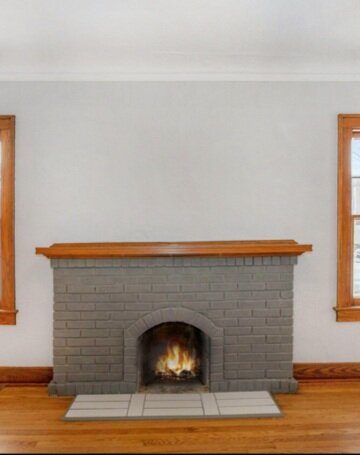
So we started off with this fireplace- you’ve seen the progression to silver.

I played around with the tile pattern for a day or two, because I wasn’t sure what I wanted. As you can see the picture below, I played around A LOT. I wanted a modern pattern, since penny tile is pretty traditional, but I was constricted in the way the pattern could go because of the tile layout. So that knocked out squares and left me with straight lines, diagonal lines, and triangles, and diamonds.

modern penny tile design blue and white penny tile.JPG

I was getting pretty frustrated, and thought that maybe I should have a glass of wine and see if I got more creative the more inebriated I was, but I ran out of time for wine so had to do the whole thing sober. Since wine couldn’t move me, I kept going and let the spirit move me, and this is what the end result was.

Blue and white penny tile modern design on silver fireplace.jpg

It was a good 5 days of working on this every day and I finally got everything grouted. I also got myself grouted, and am still scrubbing grout off my legs 2 weeks later.

Below is a picture just after I grouted it, but I haven’t fully cleaned the grout off the tile yet, so it looks pretty murky.

blue and white and black penny tile fireplace design silver brick fireplace blue walls with wood trim.jpg

Not gonna lie, I think I am more proud of this tile job than I am of most things in my life that I’ve accomplished. I now think I can tile the whole world…which I might try.

The husband got a light fixture up! And the house hasn’t burnt down because of it, so we are calling that a HUGE win. Some of our wiring is old knob and tube, so we were sort of crossing our fingers that he did it all correctly.

blue table bubble chandleir black cesca chair with blue modern art.JPG

We started to accomplish some other small projects that I was leaving till the end in case I didn’t have time to finish. They’re sort of frosting on the cake…not completely necessary, but actually the best part. (because really, who wants cake without frosting???)

I wanted to do something in this arch to transition the blue wall into the lighter room, and decided to do a very simple modern pattern. I was sort of inspired by this tile that I love and had thought about using in the fireplace, but couldn’t seriously consider it since it was out of stock due to Covid.

black and white modern speckled and lined tile.jpg

So I got out some tape and paint and went to town. It took a ton of rounds of tape to finish all the lines I wanted, and then realized I could use a black paint pen and a ruler to get the look I wanted, so that saved me some time in the end.

glass bubble chandelier with red curtains and blue table patterned archway.jpg

You see those curtains up over there? It’s starting to get exciting over here.

I also saved George for last, but I don’t want George’s ghost reading this and feeling like he’s not as important as curtains and archways.

Napolean red horse oil modern traditional art.png

So…a while back I came across this painting above in one of my art catalogs and I fell in love with the colors and weirdness. My husband also loved it (so you know we are on to something). Cue the big disappointment when I saw the painting was like $6k….oddly enough, that wasn’t in our budget.

So I got creative. I looked for old men on a horse paintings and found good ol’ george. I then shamelessly re-created parts of the painting with my own $88 George Washington painting from Walmart.com.

In the pic below, he’s not completely done, but he’s getting close to being done. I added some tiny flamingos, because every old man on a horse portrait needs flamingos. I also went around the edges of the portrait with our old Lime Green front door paint, because….well, because why not??

(if you look close, you’ll see this color in one other spot in the rooms…I’ve decided I am going to incorporate this color into every house we own (BM Snow Cone Green if you’re curious)

George just hanging out in our basement

George just hanging out in our basement

Stay tuned for the big reveal next week.

Oh I can hardly wait to see the pictures. And also- don’t forget to go and check out all the other crazy amazing transformations happening at the One Room Challenge site.


One Room Challenge.jpeg
 

One Room Challenge: Week 6. Curtains, Tables, & Flamingos, OH MY!


One Room Challenge: Week 6. Curtains, Tables, & Flamingos, OH MY!

So here I sit in western Wyoming in a car that is shaking from the wind blowing crazy around us at a campsite we reserved but are going to leave because there's a chance we will all blow away down the canyon. And that's saying a lot since we all gained the Covid-19.

Blue dining table with black cesca chairs and black art.jpg

It’s Week 6 of the One Room Challenge and we’ve done some work in the past few weeks.  That’s all we’ve been doing as we were working 12-14 hour days trying to finish our room(s) before we left on our 6 week cross country road trip adventure extravaganza.

Okay this blue table- bought it for $40 on CL and finally finished sanding and painting it.  So much sanding.  Looks pretty sweet now though...especially next to those two new pieces of art I got- they are a cynaotype which uses a photo negative and a chemical process in the sun to achieve the look- no ink! Up close it’s on water color paper and looks super neat.

Yes, I just used the word neat.

Pierre Frey red fabric.jpg

Fabric for the dining room curtains finally came.  I’m in love with this fabric from Pierre Frey- the perfect mix of some old tradition with modern built in. Plus that red!

I also finally decided on living room curtains.  Covid really put me through the curtain ringer here. Almost as stressful as getting Covid and being on a ventilator, I’m sure.

Anthropologie blue and red flowered curtains.JPG

My original LR curtain plan was these blue and red/pink numbers from Anthropologie. But then it turned out the blue was really more a of a green, and that wasn’t what I was going for, so back they went.

See?  This is definitely green.

See? This is definitely green.

I wanted something blue and red- so found a bunch of different potential fabrics from spoon flower that I ordered samples of.  Except because of Covid I didn’t get the samples in time.  I can’t even list all the different fabrics I was interested in, but couldn’t get because of Covid.

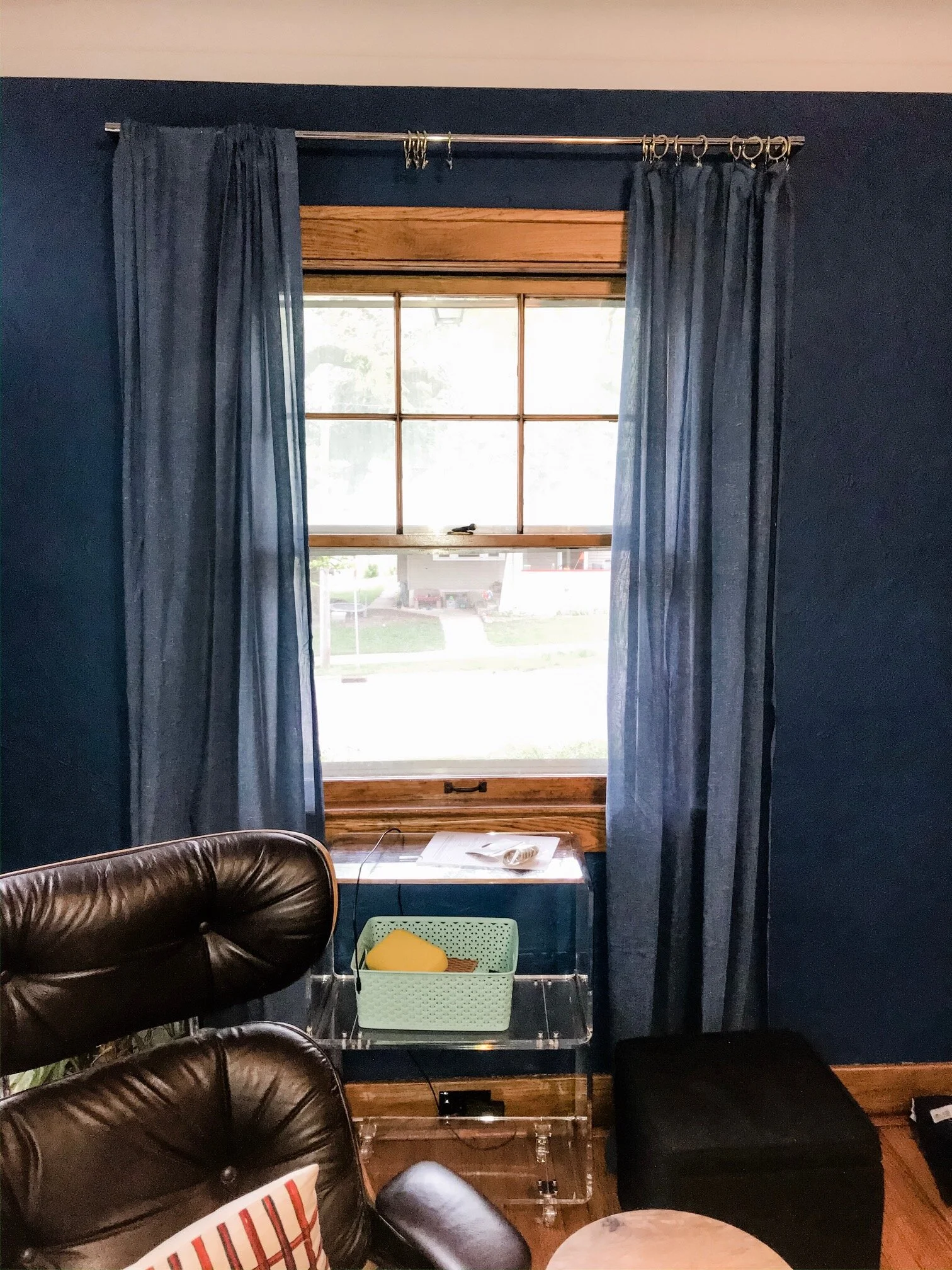
Blue curtains with blue wall and wood trim.JPG

I ordered these plain blue ones as backup but they were just too plain and boring and who wants to be boring?

I was on a crane kick from the crane spoon flower fabric I saw, so I searched for crane fabric and came across this Genevieve Gorder fabric.  So many fun colors. I ordered it in blue and black and figured I’d decide when it got here.  The blue arrived first- I loved the pattern but something just seemed off. So I started looking for other options online.

Blue Genevieve Gorder Flock curtains with blue wall and wood trim.jpg

And then the black and white crane curtains came and saved the day and ended my obsessive compulsive curtain researching.

Once again, some amazing styling going on in those bookshelves.  RIP my poor dead computer.

Once again, some amazing styling going on in those bookshelves. RIP my poor dead computer.

Because of Covid and everything being closed, I made and hemmed all the curtains for dining and living room by myself. Please note my definition of “made” is very loose.  I got some fabric hemming tape off amazon and hemmed those suckers all the way around. I then used curtain clips to connect them. It was super easy but time consuming.

But free, so there’s that. I saved so much money “sewing” my own curtains I’m basically making money over here.  I think that’s how that works?

Barn wood walls painted blue.jpg

Remember the mudroom paint color conundrum? I couldn’t handle the color and neither could my coworker, so we painted it black as originally planned.  She felt so strongly about it she offered to help me paint it.  I felt so sick of painting, that I took her up on it.

But realized I didn’t take a picture of it black so you’ll have to wait for the end product since I am currently sitting in the middle of Wyoming.

Okay phew.  That was a lot of talk about curtains and fabric.  But all the obsessing was worth it because both sets of curtains really make the rooms.  Along with all the other stuff.

Next week I’ll get into the process behind the fireplace tile and some finishing touches projects.

George Washington on a horse painting.jpg

Oh yes, there was a big box on the fireplace a few weeks back.  This is George, and George lived in that box.  You might be disappointed because you’re like, “seriously?! George?!” We were waiting for George??!

George is getting a little makeover, and here’s a little sneak peek of his makeover. You didn’t think I was going to design a room in our new house and not involve some flamingos, did you?

painted flamingos on a painting.jpg

I painted those flamingos, thank you very much. You can do anything you put your mind to and have google to look it up.

Thank you so much for following along this journey with us. We sort of suck at documenting it, but we are trying.

One Room Challenge.jpeg

As always, don’t forget to check out the other amazing rooms being transformed during the One Room Challenge. There’s some cool stuff going on!!