Blue-alicious. A Paint Color Journey. ORC: Week Two
Week two of the One Room Challenge brought to you by the fog of sickness, craziness of moving and being driven literal bananas by 3 children.
I’m pretty sure we all have Covid, even though I tested negative..but with false negatives 30-40%, and having almost all the symptoms between us, it sort of makes sense.
First Coat of Honorable Blue by SW
So tired. But life must go on, and right now life includes the One Room Challenge. Life also includes raw sewage coming up into the basement of our new house due to a broken sewage pipe (thankfully on city property(we think)), but no one wants to read about that, so we are sticking to paint colors today.
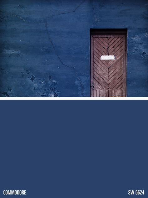
All right- where were we? Blue-alicious should be the title of this room. The color I had picked out for this room was Commodore blue by Sherwin Williams. I was going off this swatch above from the computer, which looked the same as my SW paint swatch book in person.
Now. You will read to always get paint samples and try them on your walls prior to picking a color. In fact, I ALWAYS advise my clients to get samples and try them on multiple walls to see what they look like IN the room on different walls with different light.
But sort of like a doctor tells his patients to lose weight and then goes and eats 4 donuts, I decided I didn’t need to do this. There was a pandemic going on after all, and I was trying to decrease the amount of trips I needed to make to pick up paint from the curbside paint pick up.
Not only did I NOT do this, while on the phone with Sherwin Williams, I called an audible (the only football reference I know and will use) and changed my mind to Honorable Blue. A blue with purple undertones.
Yeah…I was sitting there staring at the paint deck looking at those purple undertones, and somehow still thought was a good idea. (hint. It wasn’t). See above. Now you’re probably thinking it doesn’t look that bad- on my computer screen it looks less purple than it does on my phone, which looks less purple than in real life. Let’s just say it looked PURPLE!
Yay! Now after 3 coats of a purplish superman blue, I get to repaint! Yay!
So I went and got 5 different colors and did what I should’ve done originally. Now- you shouldn’t paint the swatches right on the wall when the colors are so crazy like this, because the wall color is going to throw off the real color of the swatch. I also painted them on white paper so I could get a sense of the true color. But I wanted to see how many coats it was gonna take to repaint over purple superman.
From Left to Right: Commodore blue, Loyal Blue, Regatta, Salty Dog, Dress Blues
This is where it gets crazy, and why you should ALWAYS paint swatches before picking a color. The color I liked the least prior and almost didn’t even get a sample of? That’s the one that looked best in the room and I loved.
Regatta by Sherwin Williams is the middle color and is what I picked. See below after being completely repainted.
It’s actually exactly what I was looking for- less dark and more color than a navy, but not as bright and crazy as cobalt. It looks different in all different lighting situations which I LOVE.
And you can see what else we accomplished this week. We moved all our crap into the house.
Regarding paint in dining room…I think I might just leave it. Looks white to the eye, but is actually a very very pale gray. Pale enough for me to look sort of white, which means I probably won’t paint it right now, because we are going to have to get the ceilings fixed eventually, and then I can repaint then.
I’ll be lucky if I can get all the boxes unpacked and organized before the ORC ends, much less finish these rooms. Holy Moly does everything take about 193 times longer when the children are around 24/7 and one is exhausted and sick.
You’re welcome for probably the least interesting ORC update of the year. Gonna go take a nap now…mmmkay?
To check out the progress of others during the ORC, head to this link and see what every body is doing!


