Gucci Grandma Kitchen: One Room Challenge Reveal
We. Are. Done.
Done. Done. Done with our second One Room Challenge.
(well…we still have to actually put all of our junk that is currently in bins all over our living room into the mudroom cabinets…but that seems like a good job for a Saturday afternoon with a cocktail in hand).
First off- we want to thank Linda from Calling It Home and Better Homes and Gardens for hosting the One Room Challenge. Without them, there is NO WAY we would’ve had neither the motivation nor the drive to finish this in 7 weeks.
A big shout out and thank you to Belwith-Keeler for sponsoring this project and providing cabinet hardware for the kitchen and mudroom.
And let’s not forget to thank our talented photographer Dionel, from The Mittentog…without whom we would be left with our 3 year old to take the pictures.
Kitchen & Mudroom you ask? I thought this was a ONE room challenge? My brain works in funny ways…I hear One Room Challenge and my brain says, “Why don’t you decide to do 3 rooms?! That would be a good way to conserve energy and strengthen your marriage!”
Apparently math and logical thinking aren’t my strong suits.
We started with a kitchen that wasn’t terrible…it had new cabinets and countertops from the previous owners, so I did not want to rip everything out.
I wanted to add just a little bit of personality to make me happier about being a short order cook for three of the world’s most demanding restaurant patrons.
The bathroom was right next to the kitchen, and had pretty ugly paper-like linoleum floor, and no other personality.
The mudroom was nice if you ignored the barnwood….and happened to be a family of one and needed zero storage space.
Disclaimer: Just like I don’t know the meaning of the number one, I also don’t know the meaning of ‘a little personality’.
So without further ado…Behold, (per my husband): The Gaudy Grandma Kitchen
I prefer “Eclectic, Modern-Vintage Kitchen”, but what are you gonna do? (He did upgrade me to Gucci Grandma Kitchen by the end of it).
Waiting for my Gucci sponsorship to come through…
As you can see, we removed the window by the bathroom door and had it drywalled, and installed some open shelving. This kitchen was not only boring, but also had zero storage.
We tiled the backsplash, counter to ceiling with black zellige type tile from Tile Bar.
Then, to create MORE storage….and a cozy place to hang out, we had our friends at Re.dwell build us a banquette bench with drawers underneath. That’s six feet of premium kitchen storage folks.
It would be a tight fit, but I could fit at least two of my kids under there if need be.
I had a banquette plan for this space when we bought the house, so I bought the marble table from World Market & the lucite chairs from CB2. The light fixture is the FL/Y pendant from Kartell and helps make the sapce!
I took my upholstery skills to a whole new level and upholstered the bench giving it a built in upholstered look with a channel tufted back in some crazy, modern, black and white fabric from Spoonflower.
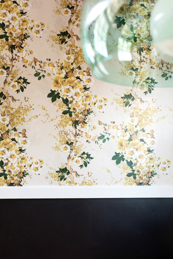
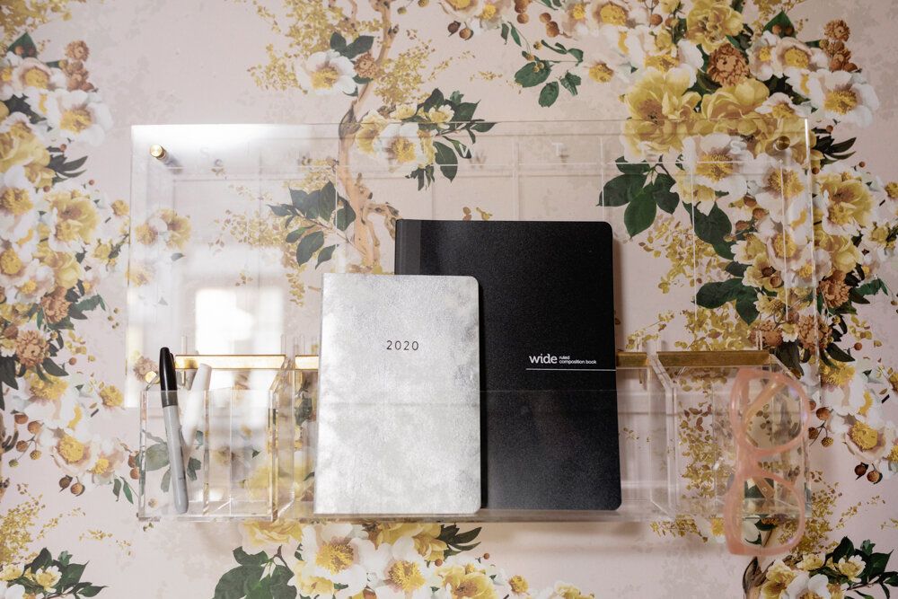
The yellow floral wallpaper from Drop It Modern was something I loved (yellow being my favorite color), but was a bit nervous about. It may not be everyone’s cup of tea, but I loveeeee it.
Originally, I was planning on painting lower cabinets a dark green, but made a decision midway through the process and decided to go with a yellow tone from the wallpaper. Yellow being my favorite color and all.
The bathroom design was based on leftover tile we already had from our previous projects. We did a 2” matte black hex tile on the floor and 4” square white subway on the walls. And then because I couldn’t contain myself, black and white malachite wallpaper on the walls and ceiling from Cole & Sons.
When the door is open, the black and white wallpaper makes a play with the black and white upholstered bench back in the kitchen. It’s not the same matchy-matchy, but it’s not all that different.
For the mudroom, we had the barnwood walls removed, and installed drywall, took out one of the windows, so we could install floor to ceiling cabinets.
I can definitely fit all 3 of my children in these cabinets…
In the mudroom we did Ikea cabinets with Semihandmade fronts. Black pulls are from Belwith-Keeler. It isn’t hard to put together Ikea cabinets, but it did come with a little bit of PTSD from our last Ikea project.
We still have the countertop to install and some shelving in the mudroom, but it’s pretty much done.
Thank you so much to all of you for your cheerleading while we worked to finish this project. Seeing your excitement made me work harder to get all these projects finished on time.
It was SO much work and I’m really tired (and my husband is tired of all the house projects), but I’m super thankful for the push to get it done.
I don’t think he reads my blog, but if he does…I’m finding out if he reads to the end of my blog….a big, huge, tremendous, thank you to my husband for being a good sport and tiling everything, installing pulls, trim, and almost anything else he did throughout.
He complained a lot, and he’s leaving tomorrow on a fun trip for a week “in payment” for his work, but I wouldn’t have been able to do it without him.
As always….don’t forget to check out all of the other guest designers here and the amazing featured designers of this season.
If you want to see the whole process click on the below links for week to week progress.
Week One I Week Two I Week Three I Week Four I Week Five


