Interior Design

Hex Tile Besta Ikea Console Hack


Hex Tile Ikea Besta Console Hack

I wanted to create something custom and unique that almost anyone could copy without having to have a bunch of skills.  You need some skills, but not a bunch. 

Call it a console, a media cabinet, a buffet, call it whatever you want as long it’s pretty.

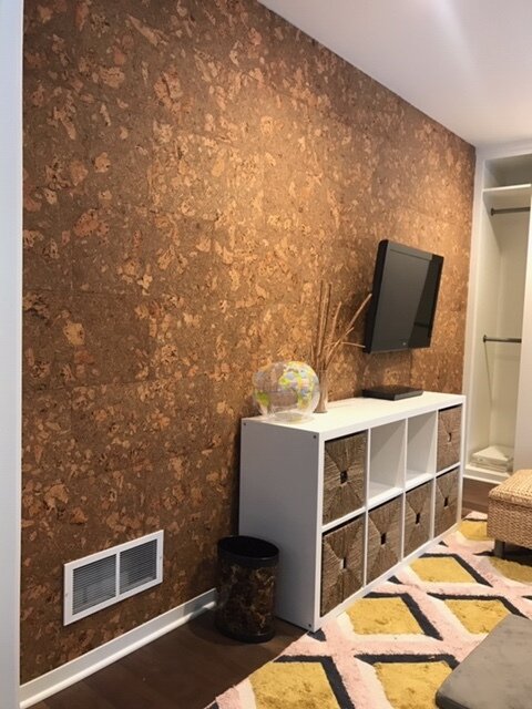
39.corkwall.credenza.modernart.grandrapids - Copy.jpg

To hack this, you don’t need to be an expert wood worker.  For this particular version, you would need to be able to tile…or you would need to be able to pick up the phone and dial a number and find someone to tile it for you, like I did.  

Generic storage unit we had before

Generic storage unit we had before

If the tile you use is not expensive, and you want a custom look, it is still much cheaper to hire someone than it would be to buy a custom console.  

Other options to give the top a different look is a cool piece of wood or some funky wallpaper. 

How we made this particular console.

The process

The process

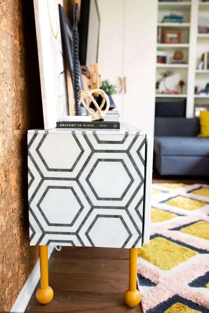
In order to keep the tile flat and not have it potentially buckle if the console itself became unlevel, we first put james hardie cement backer board on the top and sides.  (look close at this pic and you can see the screws and cement board- we lost some pics of the process in a deleting accident.)

IMG_9045.jpg

Then came the tiling part.

Due to the particular tile we picked and some of the small pieces it had, it would’ve been extremely difficult, if not impossible to to miter the edges at a 45 degree angle to have a true waterfall edge.  So we did the next best thing and made sure the pattern lined up.   

44.tiled.credenza.mustardrug.jpg

We used a black schluter strip in black to edge the tile and hide the cement backer board.

We bought legs from pretty pegs in a fun color.  We started with 4 legs, but with the weight of the tile, we needed to add 4 more legs in the middle so it didn’t sag in the middle.

Swatt_Co_Lowres-65.jpg

These legs were the 17” legs from pretty pegs, which we like the look of better, but it made the console a little too tall for the space, and a little more wobbly than we liked considering this was going to be used for kids toys, and we didn’t want the kids to yank a drawer open and topple it over on them. 

If this wasn’t being used by kids a lot, I would’ve felt comfortable keeping them as is.  But since it is being used for kids, and we sort of like our kids most of the time, we figured we didn’t want them to die in a freak furniture accident, so we cut the legs shorter.  (and by we, I mean my husband). 

40.styled.credenza.corkwall.michigan.interiordesign - Copy.jpg

If pretty pegs doesn’t have a color you like, paint them! They paint really easily!  We bought the first 4 in yellow ochre and then by the time we realized we needed 4 more, they weren’t selling yellow anymore, so I ordered some wood ones, and got a custom match at the paint shop and I can barely even tell which leg is which!

Swatt_Co_Lowres-78.jpg

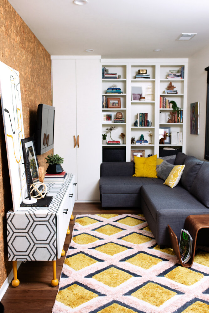
We moved it into our house and set pretty things on top and a bunch of ugly plastic toys inside and called it a day. 

If you have any questions, ask below in the comments!


Before & After of a Vintage-Modern Kitchen in Grand Rapids, Michigan


This was a project we finished last summer in the city of Grand Rapids.

The house was built in the early 1900’s and had been refinished (rather poorly might I add) by previous owners a few times to create a hodge podge of finishes. 

It still retained some of it’s amazing vintage charm and had so much potential. 

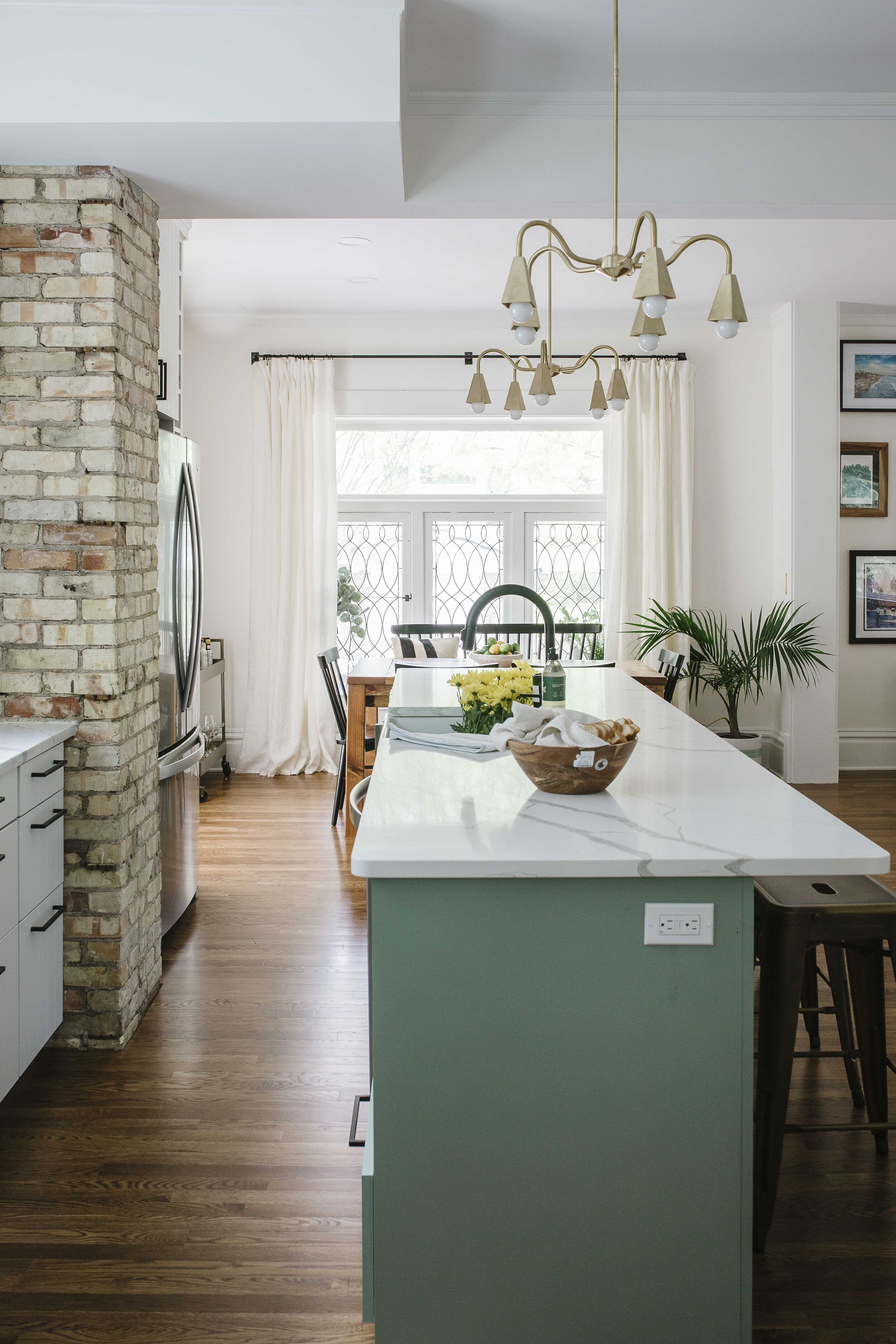
Before View- Keep an eye out for that brick pillar to get your bearings in the afters.

Before View- Keep an eye out for that brick pillar to get your bearings in the afters.

Multiple doors coming in and out

Multiple doors coming in and out

The owners really really wanted an island, and an open concept kitchen/living space.  It was pretty tricky, but by being creative and breaking a few kitchen design rules, we made it happen. 

Recognize that brick pillar??

Recognize that brick pillar??

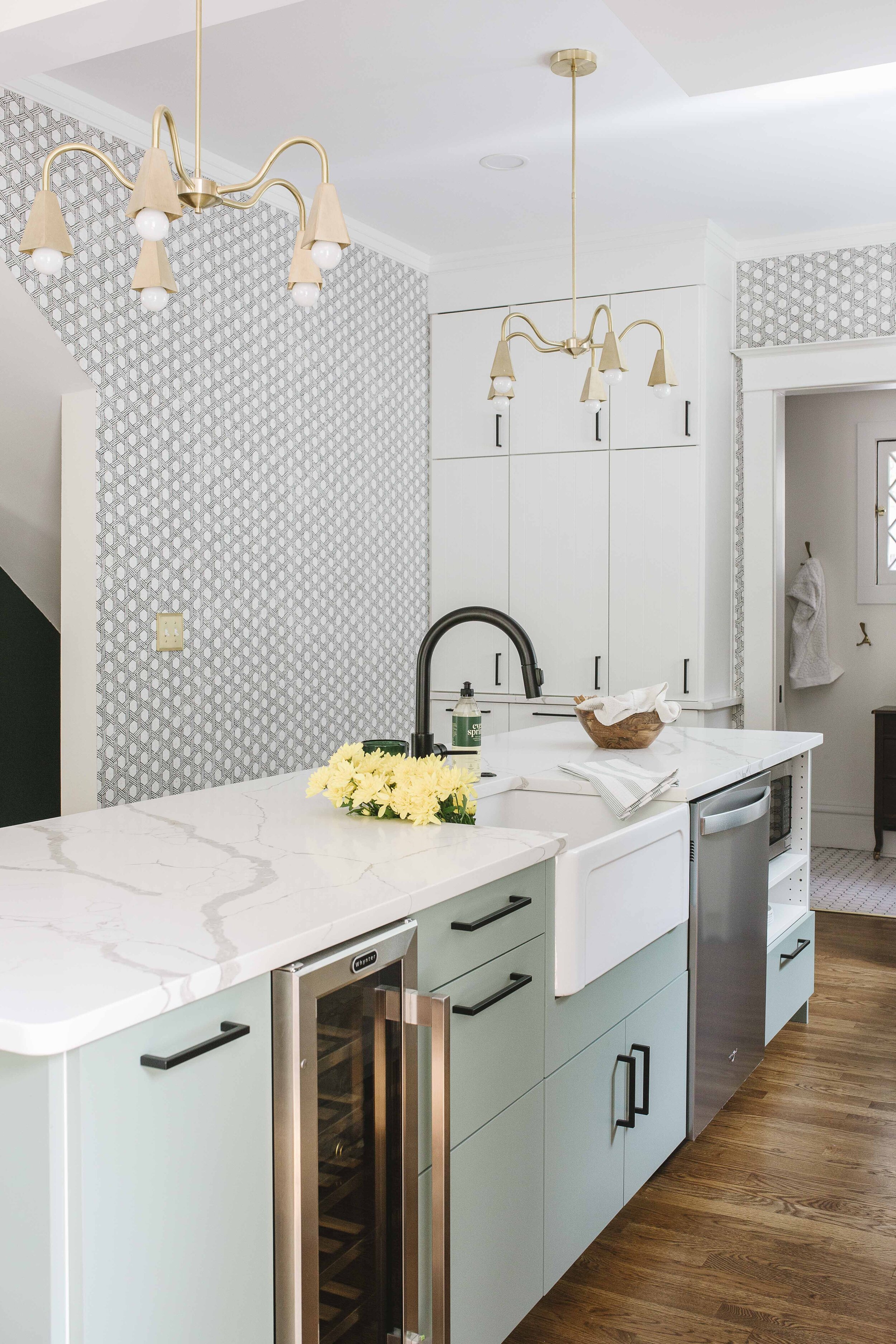
The biggest rule we broke was the width of the kitchen walkway between island and stove.  A walkway in the kitchen should ideally be 48”, but 42” for smaller kitchens is perfectly acceptable and feels spacious.  In this kitchen, after discussing it extensively with our clients and warning them about the fact that it might feel cramped with more than one person in the area, we cut the walkway space down to 36”. 

36  light green kitchen island.jpg

They felt the trade off for being able to have an island was worth giving up that extra space for maneuvering. 

The other ‘sort of rule’ we broke was depth of the overhang.  We did a 9” overhang, which is the ABSOLUTE minimum overhang you should do if you want people to be able to sit comfortably.  14-15” is ideal in a perfect world, and we’ve done up to 18” overhangs in houses with tall people. (Imagine a tall persons knees on an airplane and then imagine them trying to sit at an island with a short overhang comfortably). 

33 open shelving subway tile kitchen backsplash wall sconce above range.jpg

We needed a range with a down draft vent, so we could put the range in front of the window.  While a window isn’t ideal for a range, it works -- I refuse to put a range in an island as it a complete and utter safety hazard and if people had ever taken care of kids with grease and hot water burns, they would never do it either.  Off soapbox.

50 white kitchen floor to ceiling cabinets old door semihandmade kitchen cabinets. ikea kitchen.jpg

We did cupboards all the way up to the ceiling and an appliance garage to the left of the stove. 

Overall, we (and more importantly, our clients) are super happy with the way it turned out and the way it functions.  Beautiful kitchens are always great, but if they don’t function well…well, ain’t no one got time for that. 

23 Modern Vintage Kitchen Modern farmhouse Sage Green kitchen Island Wallpaper in kitchen.jpg

In a few weeks we’ll be sharing all of our sources for this kitchen, so keep your eyes open! 


6 Spaces Using Sherwin Williams Tricorn Black


6 Spaces Using Sherwin Williams Tricorn Black

At the end of the day in our family, we try to talk about our Best & Worst things that happened to us, and a kind thing we did.

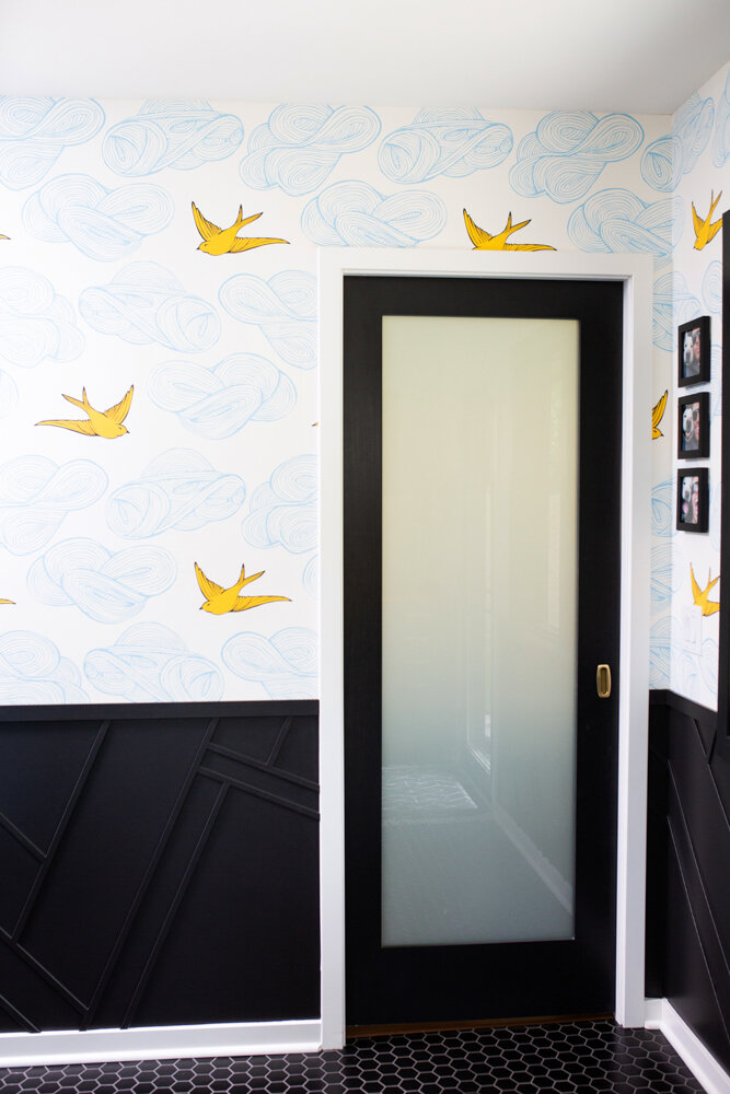
Tricorn black in BM Pearl on wall and Semigloss on door.

Tricorn black in BM Pearl on wall and Semigloss on door.

Sharing all these pics is my kind thing for the day.  And I can tell you right now, if you’re searching for the perfect black paint color, this is the best thing of your day.

I can say that because now you don’t have to get 10+ black paint samples in search of the ONE TRUE BLACK that will go in almost any situation.

You’re Welcome.

Tricorn Black on Door in semigloss. Of course there are marks on the door…insert eye roll…

Tricorn Black on Door in semigloss. Of course there are marks on the door…insert eye roll…

Raise your hands if you ever search for a paint color on pinterest only to be directed to a link that has nothing to do with the paint color you want to see in real life rooms?  Yeah, it sucks. 

So instead of making you read a thousand words before I show you any more pics, see all the areas we’ve used Sherwin Williams Tricorn black. 

Tricorn Black in Matte on Ceiling

Tricorn Black in Matte on Ceiling

We used a lot of black in this house, and this color worked in EVERY single spot.  That’s hard for one single color to do….I just gave the color Tricorn Black a lot to carry on it’s small shoulders, but I know it’s up to the job.    

I will continue to use this color everywhere. 

Tricorn black semigloss next to Hygge & West Pattern People Wallpaper

Tricorn black semigloss next to Hygge & West Pattern People Wallpaper

If you’re wondering about different sheens, the window trim and doors are all painted in semi gloss, the bathroom ceiling is in a flat/matte sheen, and the black geometric half wall is in Benjamin moore “Pearl”.  YES! You can get Sherwin Williams paint colors mixed up in Benjamin moore sheens (and vice versa).  Peral is this GREAT sheen that is a mix between satin and eggshell.  It is less shiny than satin, but moreso than eggshell, so it possesses a greater cleanability.  It’s amazing actually. 

Tricorn black in semigloss against Newberg Green Walls in Flat

Tricorn black in semigloss against Newberg Green Walls in Flat

Tricorn black in semigloss against OC 130 Cloud white

Tricorn black in semigloss against OC 130 Cloud white

And that’s it folks! Go buy yourself some paint!