Interior Design

Wait, What?! Is that Fireplace Silver?? ORC Week Three


Wait, What?! Is that Fireplace SILVER? ORC Week 3

All I gotta say is that I can’t imagine actually renovation a room in this 6-8 week time period.  I’m mostly just doing small projects and painting and fixing some stuff up and I feel like I don’t have time to get it all done.  (I believe that may have something to do with the 3 creatures who cling to my legs a lot, but could be other things).

IMG_0165.jpg

We did make progress though this week! We still aren’t feeling 100%, but had some energy to get some junk done.

I spent my one days sans kids sanding/painting all the shelves and cabinet doors that go in the recessed arched bookcases.  Letting the paint cure a few days before I try to install them.  Especially because I just used normal wall paint I had leftover as opposed to spending $30 on a quart of cabinet paint.

These aren’t going to see much use, and mostly are just going to sit there and look pretty, so I didn’t see the point of the added expense (and trip to pick up the paint). 

Don’t it look pretty with those doors installed? 

My dad thought I was committing a sacrilege by painting the wood doors and shelving, but sacrilege and doing things I’m not supposed to like licking knives is what I live for. Also, he would decorate his house in real tree camo if given the opportunity, so I try not to take design advice from him.

IMG_0144.jpg

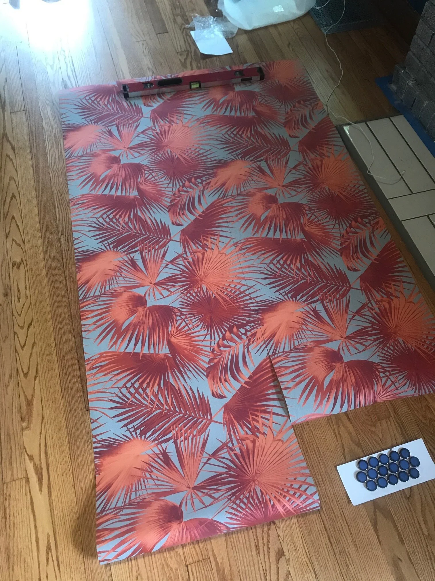
I had to time to start cutting the wallpaper, and it made me wish I could install this on the ceiling. Talk about extra. But alas, a textured plastered ceiling with rounded edges is not conducive to wallpaper. Especially since the ceiling might fall down at any moment.

Onward to the fireplace. We started out with a painted gray brick fireplace.  I love painted brick fireplaces.  I don’t love gray.  When we moved in, this house was painted 50 shades of gray, and was about as boring as I assume that movie is.

Boring Gray Fireplace going on here.

Boring Gray Fireplace going on here.

I was thinking about what color I could paint the fireplace and I wanted something that would stand out.  I went through the whole rainbow, searching for ideas.  None of the colors really spoke to me…yes, colors speak.  Then I started thinking about the paint I already had in my garage and remembered those two cans of rustoleum metallic paint sitting there.

In all of its silver shiny glory

In all of its silver shiny glory

So, I searched for a metallic silver brick fireplace on the internet and couldn’t find any.  Not finding any similar pics of what I want to do is a fun and scary thing.  Fun because, “YAY something different”.  Scary because “ummmm…What if there aren’t any pictures because it’s a really really terrible idea and everyone already knows that they shouldn’t do it.  Or they did do it and it looked terrible and didn’t want to share the pictures”.

Mid-glazing

Mid-glazing

I knew the silver would way too extra in all of its glory, so I planned to darken/age it slightly by using my trusty old can of glaze (circa 2010…I’m really going back in time here with this one).  Now you can sit in my living room and not be blinding when the sunlight hits the fireplace.  That’ll be extra special for our houseguests.

I’m 98% confident that once I’ve got the whole room together it’s going to look amazing, but it really could go either way. 

But until then, here is a picture of the fireplace in all of its current glory with an even bigger experiment sitting in that cardboard box on top of it. 

IMG_3153 (1).JPG

George is in that box, and you’re gonna have to wait to see George. 

Besides George, what’s still to do?

  • we gotta figure out fireplace tile situation and tile (choosing from samples at bottom of fireplace)

  • finishing ordering and hang light fixtures

  • finish curtain rods

  • Figure out curtain situation (covid is really killing me here because I can’t get what I want

  • Re-finish the dining room table

  • Finish art for living room

  • Paint entry way and mudroom.

  • Some small spray paint crafts

  • Style whole place

Holy crap. After reading all that I realized I need to get off my computer and go downstairs and start doing some stuff. Especially because we are going to try to get it done early and leave for a little camping adventure in a few weeks. (can’t social distance more than you can in the middle of the woods)

As always- don’t forget to go the One Room Challenge Blog and get a million more doses of design inspiration!

 

Blue-alicious. A paint Color Journey. ORC Week Two


Blue-alicious. A Paint Color Journey. ORC: Week Two

Week two of the One Room Challenge brought to you by the fog of sickness, craziness of moving and being driven literal bananas by 3 children.

I’m pretty sure we all have Covid, even though I tested negative..but with false negatives 30-40%, and having almost all the symptoms between us, it sort of makes sense.

First Coat of Honorable Blue by SW

First Coat of Honorable Blue by SW

So tired. But life must go on, and right now life includes the One Room Challenge. Life also includes raw sewage coming up into the basement of our new house due to a broken sewage pipe (thankfully on city property(we think)), but no one wants to read about that, so we are sticking to paint colors today.

sherwin williams commodore blue.jpg

All right- where were we? Blue-alicious should be the title of this room.  The color I had picked out for this room was Commodore blue by Sherwin Williams.  I was going off this swatch above from the computer, which looked the same as my SW paint swatch book in person. 

Now.  You will read to always get paint samples and try them on your walls prior to picking a color.  In fact, I ALWAYS advise my clients to get samples and try them on multiple walls to see what they look like IN the room on different walls with different light.

But sort of like a doctor tells his patients to lose weight and then goes and eats 4 donuts, I decided I didn’t need to do this.  There was a pandemic going on after all, and I was trying to decrease the amount of trips I needed to make to pick up paint from the curbside paint pick up.

Not only did I NOT do this, while on the phone with Sherwin Williams, I called an audible (the only football reference I know and will use) and changed my mind to Honorable Blue.  A blue with purple undertones. 

sherwin williams honorable blue paint color (2).jpg

Yeah…I was sitting there staring at the paint deck looking at those purple undertones, and somehow still thought was a good idea.  (hint. It wasn’t).   See above.  Now you’re probably thinking it doesn’t look that bad- on my computer screen it looks less purple than it does on my phone, which looks less purple than in real life. Let’s just say it looked PURPLE!

Yay! Now after 3 coats of a purplish superman blue, I get to repaint!  Yay!

So I went and got 5 different colors and did what I should’ve done originally.  Now- you shouldn’t paint the swatches right on the wall when the colors are so crazy like this, because the wall color is going to throw off the real color of the swatch.  I also painted them on white paper so I could get a sense of the true color.  But I wanted to see how many coats it was gonna take to repaint over purple superman. 

From Left to Right: Commodore blue, Loyal Blue, Regatta, Salty Dog, Dress Blues

From Left to Right: Commodore blue, Loyal Blue, Regatta, Salty Dog, Dress Blues

This is where it gets crazy, and why you should ALWAYS paint swatches before picking a color.  The color I liked the least prior and almost didn’t even get a sample of?  That’s the one that looked best in the room and I loved. 

Regatta by Sherwin Williams is the middle color and is what I picked.  See below after being completely repainted.

Sherwin Williams Regatta with wood trim and wood floors.jpg

It’s actually exactly what I was looking for- less dark and more color than a navy, but not as bright and crazy as cobalt. It looks different in all different lighting situations which I LOVE.

And you can see what else we accomplished this week.  We moved all our crap into the house. 

IMG_0002.jpg

Regarding paint in dining room…I think I might just leave it. Looks white to the eye, but is actually a very very pale gray. Pale enough for me to look sort of white, which means I probably won’t paint it right now, because we are going to have to get the ceilings fixed eventually, and then I can repaint then.

IMG_0003 (1).jpg

I’ll be lucky if I can get all the boxes unpacked and organized before the ORC ends, much less finish these rooms.  Holy Moly does everything take about 193 times longer when the children are around 24/7 and one is exhausted and sick.

You’re welcome for probably the least interesting ORC update of the year. Gonna go take a nap now…mmmkay?

To check out the progress of others during the ORC, head to this link and see what every body is doing!

ORC-Gold-4oow.png
 

One Room Challenge: Week One...Living & Dining Room Makeover by Swatts & Co


One Room Challenge: Week One…Living & Dining Room Makeover by Swatts & Co

A little more than two months ago I was in San Francisco at the Design Influencers Conference sitting less than 6 feet away (those were the days) from some awesome designer friends chatting about the One Room Challenge. 

The One Room Challenge is a bi-annual interior design event where designers/bloggers/home renovation enthusiasts transform a room in 6 weeks.  It’s a super fun event that I’ve watched from afar for years. 

Some of my friends were participating this year, and I was lamenting that I didn’t have any rooms in my house to re-do as I had literally just finished my whole house. (I know…poor poor pitiful me).

So I did what any rational human being would do, and I sold our house and we bought a really old house that needs a little loving. (that may not be exactly how things went down, but you can read about the whole selling your house right before a pandemic story here). 

So now I have a room to re-do.  Because of all the stay at home orders and this whole deadly pandemic thing, the theme is sort of a DIY and use what you have type theme depending on location and what’s going on due to Covid…also due to Covid, the ORC has been extended to 8 weeks.  Which is nice since we just moved into our house two days ago, and it’s still filled with boxes.

I am going to be transforming our living room and dining room and maybe the entry way…depending on how much time I have and how long I can lock the three children outside. 

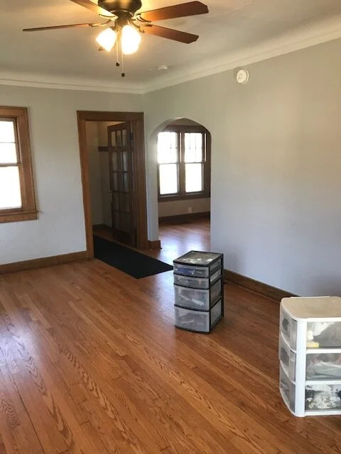
Before

IMG_9760.jpg

The house was built in 1928 and is a Folk Victorian house.  (fancy talk for a poor persons Victorian because it ain’t got no  frou frou stuff going on).

It might not have frou frou stuff going on, but it has arched built in bookcases and a tiny fireplace, so I was sold. 

IMG_9762.jpg

Few rules for designing this house: Needs to be semi-budget friendly, since it will eventually be a rental.  Since it’s going to be a rental, I’m trying to go with colors a large majority of people don’t hate, because I don’t want to repaint 14 times.  I’m going to try to re-purpose and re-use as many items as I can for these spaces. 

Dining Room Before

Dining Room Before

Our last house was very modern, so it’s going to be a fun challenge to take items out of modern and put it into an old space. 

I’ve been super into blue and red as a color combo  for the past few months, so I decided to run with it.

Below is a mood board for the living room. 

oneroomchallenge.week one. blue and red living room.png

It’s a crap shoot if any of it actually turns out like the picture, because a lot of samples I need for the project are delayed because of Covid (how dare these people delay production for their safety) so I don’t know if I’ll be able to order what I need.

A lowdown on the pic: We own the couch and the two chairs, the brown chair will be reupholstered. The rug was in our master bedroom in our old house, and is gonna make a primetime appearance. The rest is all up in the air.

The dining room is connected to the living room via a 5’ wide arched doorway (yay for arches!) and will sort of go with the theme, because can you have too many themes?

One room Challenge week one blue and red dining room.png

I found a table on FB marketplace for $40 that I’m going to sand down and paint a high gloss blue (table in pic just for inspiration). Some potential fabric for curtains, and we’re going to re-use our media console from our TV room as our new bar. (somehow the liquor got unpacked prior to the kids toothbrushes). We are going to re-use our cesca chairs and pair modern with old.

If you want to follow along as we go on this journey, click below to sign up and get on our email list.

You can also go to the One Room Challenge website and follow along with the 20 featured designers or hundreds of guest participants like me!

To see following weeks, click on the links: (To see where we started, click here: Week Two, Week Three, Week Four, Week Six, Week Seven,


DIY Wallpaper Home Office Peg Board


DIY Wallpaper Home Office Peg board

Sometimes you just gotta organize a bunch of crap and there aren’t a lot of pretty ways of doing it.

Or maybe a worldwide pandemic happened and you find yourself home schooling and you’re not sure where to put all the art supplies.

32.blueyellowwallpaper.bluecabinets.woodcountertop.grandrapidsinteriordesign.laundryroom - Copy.jpg

Maybe you decided to wallpaper a laundry room and you realize that your kids craft desk being in said laundry room is gonna ruin that really amazing wallpaper you just put up and you have to figure out a way to protect it. (hypothetically speaking, of course)

Maybe you just have some leftover wallpaper and are looking for a project to use it up. 

Or maybe all four as in our case. 

We have this great counterspace/desk area in our laundry room that our oldest uses as her personal craft studio.  Originally it was going to be my desk….guess where I’m not working?  The laundry room. 

I just can’t compete with the stacks of coloring books and piles of glitter glue. 

Ikea.skardis..png

Ikea to the rescue! I came across the Skardis Pegboard online at Ikea…And thought “self, I could wallpaper that pegboard and make it real pretty”.   So that’s what myself and I did. 

It’s super cheap and super easy. 

Buy however many Skardis pegboards you need (we used 5 panels of the 14”x22”).  Figure out what accessories you want for pegboards.  (they come in white and black which is handy).

Figure out where you want the accessory baskets and clips before you attach wallpaper. 

Trace the outline of the pegboard on the back of the wallpaper.   If you want your wallpaper to line up in a certain fashion, then figure that out when you’re tracing and BEFORE you cut…always before you cut. 

I didn’t care if mine matched up perfectly, but I wanted to make sure there was a yellow bird on each board.

Elmers Adhesive spray.png

I then sprayed the front of the pegboard and the back of the wallpaper with elmers adhesive spray and stuck it on there. 

34.blackhexfloor.laundryroom.kidscraft - Copy.jpg

Now you can attach pegboard to wall following directions Ikea gives.  Then punch holes in the places you want to hang the accessory pieces (this is why you figure out where you want them first, so you don’t ruin your pretty wallpaper job with needless holes).

35.5.Laundry room craft pegboard wallpaper.jpg

Voila! You’ve got yourself a pretty place to organize a bunch of crap!  This could work on a normal pegboard material too- but then you don’t have the pretty accessories for storage from ikea. 


Swatts & Co Housing Update: Corona Edition


If you follow me on Instagram you probably know that we sold our house and are moving (and if you don’t follow me on Instagram, why not??).

Here’s a funny story for you that you might not know.

Forever House they Lost

Forever House they Lost

Once upon a time, a couple had the opportunity to sell their house, and sold it- despite not having a house to move into.  They figured spring was around the corner, and there would be plenty of houses coming on the market and would give them plenty of time to find a house. 

(we needed to move, because we had a million children(okay, 3) living in essentially a two bedroom house, and wanted a slightly larger house so we didn’t have to share a bedroom with a child for 16 years)

The wife was a planner.  So even though they didn’t have a house to buy, she made contingency plans.

Plan A-D..she had it covered…multiple back up plans of where they could live if they didn’t find a house they wanted.

Amazing original tile entryway

Amazing original tile entryway

The couple put an offer on an amazing mid century house and were so excited they didn’t have to move in with their parents at age 37.  And then they lost the house to a competing offer that was all cash.

And then a worldwide pandemic came and stopped the economy and pretty much the entire world.

Grand Rapids Interior Designer5.jpg

Guess what happens when a pandemic stops the entire world? The real estate market stops.  Like, just stops.  Not only is no one listing their house, realtors aren’t allowed to show houses to clients, because apparently housing/shelter isn’t considered “essential”.  But the couple had already sold their house and needed to be out of it soon.

This is silly.  So Plan A is gone.  What’s also silly is that this pandemic pretty much knocked out Plan B & C as well.  Can’t move in with your parents when they’re older and you don’t want to expose them to the virus.  Rent an apartment for a few months?  Hmmmm…..not knowing when this pandemic is going to end and when the economy will start back up again, moving into a 2 bedroom apartment with 3 children for an indefinite amount of time just didn’t seem like great for mental health reasons.

They also didn’t want to rent a house and then come across their ‘forever’ home and break a lease.  Also, the wife didn’t want to rent a house and not be able to renovate/decorate/and make it amazing, because that’s not fun and kills the soul a little bit.

It’s not like they were being picky…they just wanted either A) a really cool architecturally unique house (such as the mid century above) or B) a really really ugly terrible house that needed to be gutted and redone. How hard is it to find an ugly house?

We won’t even get into the bit about the issues getting a loan when both the husband and wife were employed, yet not currently working….despite good debt to income ratio and excellent credit scores…we won’t even go there.

Plan D or E in person.

Plan D or E in person.

So alas, here they are at Plan D or E…who knows? We’ve lost track.  Buy an house that doesn’t need a lot of work and live in it for 6 months….or 6 years…or however long it takes to find the “right” house, and then keep said property as a rental. 

This was probably the more responsible option from the start, but who wants to be responsible? 

There is an upside to responsibility. The wife had been super excited about the potential mid-century house, but was a little bummed because there is a unspoken limit of what you can do to a house that was that unique and original, without getting burned at the proverbial internet stake for design heresy. 

Pretty much buying the house because of the arches and the fireplace

Pretty much buying the house because of the arches and the fireplace

But this new house?  It’s a hundred year old house and can handle any weird and eclectic things the wife wants to do to it.  The best part? The husband gives zero ducks about what the wife does, because he knows they won’t be here forever. He realized that in order to stay married, they needed to find a house to live in, because the wife was not going to live in a van with their 3 children in the midst of a global pandemic. 

But don’t think he didn’t try to sell the van idea.

Might need a little bathroom update…

Might need a little bathroom update…

What do you think the wife is gonna do?  Be safe and boring?  Nope.  Wife gonna go *cray cray.

And they all lived happily ever in their tiny new-old home. 

*Craziness starts in the beginning of May with the start of the One Room Challenge- a celebration of design event where people across the country/world transform one room in 6 weeks. 


Shared Girls Room Reveal


Shared Girls Room Reveal

Welcome to the reveal of one of my favorite rooms in our house.

1.white.girls.bedroom.grandrapids.interiordesign - Copy - Copy.jpg

It caused some of the most headache design wise because it was soooo small…it’s a classic case of “when at first you don’t succeed and everything looks crappy”.

This was the room we started with before we moved in.  And then we made it a smidge smaller (so we could have a bigger closet in the master bedroom…because parents pay the bills and thus always get priority).

IMG_9613.jpg

Below is the room after renovation, with a hodge podge of items that I already owned.  I still love the curtains, and hope to use them in a different room someday.

IMG_9608.jpg

 That bed was a disaster DIY project.  I was pregnant with #2 and too lazy to refinish it the correct way, so I ended up having to refinish it multiple times and still didn’t like it, so I sold it on craiglist and bought a white bunk bed.

Originally I was going to try to use some of the items we already owned and created these two mood boards which look good in theory, but not in real life for a room this size.

IMG_9611.jpg
IMG_9612.jpg

After deciding we needed to go in a fun monochromatic direction, I came up with this mood board….the wallpaper had always been a favorite and I had contemplating using it in other colors in other areas, but the gold on white was perfect for this room.

Moodboard.girlsbedroom.allwhite monochromatic

The wallpaper is Underwater World by Hygge & West in the white & gold.  The white bunk bed is from Wayfair and the crib is from Ikea.  (we shortened the crib legs so it could fit under the bunk bed) (I didn’t want a tall bunk bed for my 5 year old, so sawing the crib legs was the safer way to go). 

We measured and shortened legs BEFORE we put crib together, which was easier, but somewhat of an oopsie, because with the crib mattress at the lowest point, there is a bolt that sticks down past the crib leg (see pic), There was no way to really know this ahead of time.  We’ve fixed the issue by putting the crib on some furniture sliders, so it lifts it up slightly so bolt doesn’t dig into our wood floors.  This also makes it easier to slide the crib out if we need to put in a sleeping two year old. 

The dresser we already owned- it was a craigslist find that I had refinished back in 2013.  I still like it, but am contemplating selling it or refinishing it again. 

6.whitegirlsbedroom.woodlightpendant.grandrapids - Copy.jpg

We already owned the white eames rocker (a reproduction we bought from amazon), and the gold table/stool from target.  The stool doubles as storage- our girls keep their dress up clothes and costumes in there, so it’s easy to pick up after play time. (The stool was from Target, but I don’t think they sell it anymore)

The white driftwood lamp, we got from an old garage sale years ago.  I painted it white to blend in.  The light fixture is from etsy, and if you look close you can see hearts on it.  It was my own attempt at being slightly cheesy, as my oldest girl only has a half a heart and has had a bunch of heart surgeries (strangely enough, the etsy shop did not sell light fixtures with half hearts, so we adapted).

5.girlsbedroom.whiteeamsrocker.grandrapidsinterior.design.whitepouf - Copy - Copy.jpg

The lucite bookshelf is from Cb2 and since it’s clear, gives the visual impression of more room in this tiny room.  Also bonus it doesn’t look like it belongs in a kid room, so is more versatile down the road. (I would’ve never spent that much for it for a kids room, if I wasn’t planning on using is somewhere else in our next house).

The shaggy rug is a less than $100 find from rugs usa.  It’s so soft and great, and held up wonderfully for a few years until our youngest daughter puked in it during a particularly nasty bout of noro virus…those were fun times.(I’ve recently learned they don’t sell it anymore- but I’ve had good luck with their rugs!) 

I debated for a long time on what to do for artwork and wall décor, but settled on super simple, because I didn’t want to take away from the wallpaper.  Just a few simple family pics and a boho macramé thing from world market. 

The curtain rods were a DIY thing, and the white curtains are a $10 Ikea special.

3.brown.white.dresser.grandrapids.mi.interiordesign. - Copy - Copy.jpg

The window trim is painted Sherwin Williams Tricorn Black.  (this is the best black ever- such a true black without undertones of different colors).  (see our post here to get pics of all the places we used tricorn black in this project). 

And there you have it- the details on everything behind our shared girls room in our East Grand Rapids Sunset Lake Blvd project!