Swatts & Co Housing Update: Corona Edition


If you follow me on Instagram you probably know that we sold our house and are moving (and if you don’t follow me on Instagram, why not??).

Here’s a funny story for you that you might not know.

Forever House they Lost

Forever House they Lost

Once upon a time, a couple had the opportunity to sell their house, and sold it- despite not having a house to move into.  They figured spring was around the corner, and there would be plenty of houses coming on the market and would give them plenty of time to find a house. 

(we needed to move, because we had a million children(okay, 3) living in essentially a two bedroom house, and wanted a slightly larger house so we didn’t have to share a bedroom with a child for 16 years)

The wife was a planner.  So even though they didn’t have a house to buy, she made contingency plans.

Plan A-D..she had it covered…multiple back up plans of where they could live if they didn’t find a house they wanted.

Amazing original tile entryway

Amazing original tile entryway

The couple put an offer on an amazing mid century house and were so excited they didn’t have to move in with their parents at age 37.  And then they lost the house to a competing offer that was all cash.

And then a worldwide pandemic came and stopped the economy and pretty much the entire world.

Grand Rapids Interior Designer5.jpg

Guess what happens when a pandemic stops the entire world? The real estate market stops.  Like, just stops.  Not only is no one listing their house, realtors aren’t allowed to show houses to clients, because apparently housing/shelter isn’t considered “essential”.  But the couple had already sold their house and needed to be out of it soon.

This is silly.  So Plan A is gone.  What’s also silly is that this pandemic pretty much knocked out Plan B & C as well.  Can’t move in with your parents when they’re older and you don’t want to expose them to the virus.  Rent an apartment for a few months?  Hmmmm…..not knowing when this pandemic is going to end and when the economy will start back up again, moving into a 2 bedroom apartment with 3 children for an indefinite amount of time just didn’t seem like great for mental health reasons.

They also didn’t want to rent a house and then come across their ‘forever’ home and break a lease.  Also, the wife didn’t want to rent a house and not be able to renovate/decorate/and make it amazing, because that’s not fun and kills the soul a little bit.

It’s not like they were being picky…they just wanted either A) a really cool architecturally unique house (such as the mid century above) or B) a really really ugly terrible house that needed to be gutted and redone. How hard is it to find an ugly house?

We won’t even get into the bit about the issues getting a loan when both the husband and wife were employed, yet not currently working….despite good debt to income ratio and excellent credit scores…we won’t even go there.

Plan D or E in person.

Plan D or E in person.

So alas, here they are at Plan D or E…who knows? We’ve lost track.  Buy an house that doesn’t need a lot of work and live in it for 6 months….or 6 years…or however long it takes to find the “right” house, and then keep said property as a rental. 

This was probably the more responsible option from the start, but who wants to be responsible? 

There is an upside to responsibility. The wife had been super excited about the potential mid-century house, but was a little bummed because there is a unspoken limit of what you can do to a house that was that unique and original, without getting burned at the proverbial internet stake for design heresy. 

Pretty much buying the house because of the arches and the fireplace

Pretty much buying the house because of the arches and the fireplace

But this new house?  It’s a hundred year old house and can handle any weird and eclectic things the wife wants to do to it.  The best part? The husband gives zero ducks about what the wife does, because he knows they won’t be here forever. He realized that in order to stay married, they needed to find a house to live in, because the wife was not going to live in a van with their 3 children in the midst of a global pandemic. 

But don’t think he didn’t try to sell the van idea.

Might need a little bathroom update…

Might need a little bathroom update…

What do you think the wife is gonna do?  Be safe and boring?  Nope.  Wife gonna go *cray cray.

And they all lived happily ever in their tiny new-old home. 

*Craziness starts in the beginning of May with the start of the One Room Challenge- a celebration of design event where people across the country/world transform one room in 6 weeks. 


Shared Girls Room Reveal


Shared Girls Room Reveal

Welcome to the reveal of one of my favorite rooms in our house.

1.white.girls.bedroom.grandrapids.interiordesign - Copy - Copy.jpg

It caused some of the most headache design wise because it was soooo small…it’s a classic case of “when at first you don’t succeed and everything looks crappy”.

This was the room we started with before we moved in.  And then we made it a smidge smaller (so we could have a bigger closet in the master bedroom…because parents pay the bills and thus always get priority).

IMG_9613.jpg

Below is the room after renovation, with a hodge podge of items that I already owned.  I still love the curtains, and hope to use them in a different room someday.

IMG_9608.jpg

 That bed was a disaster DIY project.  I was pregnant with #2 and too lazy to refinish it the correct way, so I ended up having to refinish it multiple times and still didn’t like it, so I sold it on craiglist and bought a white bunk bed.

Originally I was going to try to use some of the items we already owned and created these two mood boards which look good in theory, but not in real life for a room this size.

IMG_9611.jpg
IMG_9612.jpg

After deciding we needed to go in a fun monochromatic direction, I came up with this mood board….the wallpaper had always been a favorite and I had contemplating using it in other colors in other areas, but the gold on white was perfect for this room.

Moodboard.girlsbedroom.allwhite monochromatic

The wallpaper is Underwater World by Hygge & West in the white & gold.  The white bunk bed is from Wayfair and the crib is from Ikea.  (we shortened the crib legs so it could fit under the bunk bed) (I didn’t want a tall bunk bed for my 5 year old, so sawing the crib legs was the safer way to go). 

We measured and shortened legs BEFORE we put crib together, which was easier, but somewhat of an oopsie, because with the crib mattress at the lowest point, there is a bolt that sticks down past the crib leg (see pic), There was no way to really know this ahead of time.  We’ve fixed the issue by putting the crib on some furniture sliders, so it lifts it up slightly so bolt doesn’t dig into our wood floors.  This also makes it easier to slide the crib out if we need to put in a sleeping two year old. 

The dresser we already owned- it was a craigslist find that I had refinished back in 2013.  I still like it, but am contemplating selling it or refinishing it again. 

6.whitegirlsbedroom.woodlightpendant.grandrapids - Copy.jpg

We already owned the white eames rocker (a reproduction we bought from amazon), and the gold table/stool from target.  The stool doubles as storage- our girls keep their dress up clothes and costumes in there, so it’s easy to pick up after play time. (The stool was from Target, but I don’t think they sell it anymore)

The white driftwood lamp, we got from an old garage sale years ago.  I painted it white to blend in.  The light fixture is from etsy, and if you look close you can see hearts on it.  It was my own attempt at being slightly cheesy, as my oldest girl only has a half a heart and has had a bunch of heart surgeries (strangely enough, the etsy shop did not sell light fixtures with half hearts, so we adapted).

5.girlsbedroom.whiteeamsrocker.grandrapidsinterior.design.whitepouf - Copy - Copy.jpg

The lucite bookshelf is from Cb2 and since it’s clear, gives the visual impression of more room in this tiny room.  Also bonus it doesn’t look like it belongs in a kid room, so is more versatile down the road. (I would’ve never spent that much for it for a kids room, if I wasn’t planning on using is somewhere else in our next house).

The shaggy rug is a less than $100 find from rugs usa.  It’s so soft and great, and held up wonderfully for a few years until our youngest daughter puked in it during a particularly nasty bout of noro virus…those were fun times.(I’ve recently learned they don’t sell it anymore- but I’ve had good luck with their rugs!) 

I debated for a long time on what to do for artwork and wall décor, but settled on super simple, because I didn’t want to take away from the wallpaper.  Just a few simple family pics and a boho macramé thing from world market. 

The curtain rods were a DIY thing, and the white curtains are a $10 Ikea special.

3.brown.white.dresser.grandrapids.mi.interiordesign. - Copy - Copy.jpg

The window trim is painted Sherwin Williams Tricorn Black.  (this is the best black ever- such a true black without undertones of different colors).  (see our post here to get pics of all the places we used tricorn black in this project). 

And there you have it- the details on everything behind our shared girls room in our East Grand Rapids Sunset Lake Blvd project!


Top 41 Corona Virus Memes


Top 41 Corona-Virus Memes

We are taking a break from our regularly scheduled programming of paint colors and kitchen before & afters to bring you something that really matters: memes.

IMG_9239.jpg

Yup. We’ve curated a list of our favorite corona-virus memes for you.

Fair warning to my mother and to any children: some of these have bad words. (didn’t write them mom, just sharing them).

Fair warning to everyone else: some might be slightly morbid. But if you’re wondering how Drs & RNs get through all the crap they get through, it’s by joking about all of the below.

Big thanks to my fellow Nurse Anesthesiologists who contributed their fav memes.

IMG_9241.jpg
IMG_9242.jpg
IMG_9240.jpg
IMG_9238.jpg
IMG_9237.jpg
IMG_9236.jpg
IMG_9235.jpg
IMG_9234.jpg
IMG_9233.jpg
IMG_9232.jpg
IMG_9231.jpg
IMG_9230.jpg
IMG_9229.jpg
IMG_9228.jpg
IMG_9227.jpg
IMG_9226.jpg
IMG_9225.PNG
IMG_9224.jpg
IMG_9223.jpg
IMG_9221.jpg
IMG_9211.jpg
IMG_9209.jpg
IMG_9210.jpg
IMG_9207.jpg
IMG_9206.jpg
IMG_9204.jpg
IMG_9205.jpg
IMG_9203.jpg
IMG_9202.jpg
IMG_9201.jpg
IMG_9199.jpg
IMG_9196.jpg
IMG_9197.jpg
IMG_9198.jpg
IMG_9195.jpg
IMG_9194.jpg
IMG_9200.jpg
IMG_9191.PNG
IMG_9192.jpg
IMG_9190.jpg

And there you have it. You’re welcome.


Hex Tile Besta Ikea Console Hack


Hex Tile Ikea Besta Console Hack

I wanted to create something custom and unique that almost anyone could copy without having to have a bunch of skills.  You need some skills, but not a bunch. 

Call it a console, a media cabinet, a buffet, call it whatever you want as long it’s pretty.

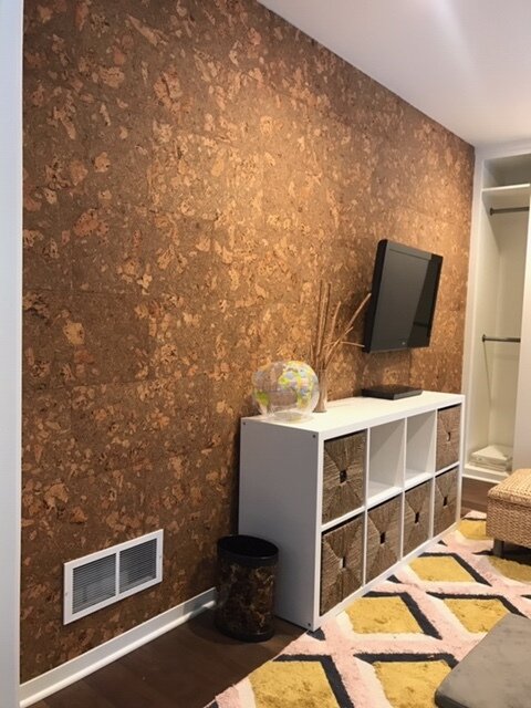
39.corkwall.credenza.modernart.grandrapids - Copy.jpg

To hack this, you don’t need to be an expert wood worker.  For this particular version, you would need to be able to tile…or you would need to be able to pick up the phone and dial a number and find someone to tile it for you, like I did.  

Generic storage unit we had before

Generic storage unit we had before

If the tile you use is not expensive, and you want a custom look, it is still much cheaper to hire someone than it would be to buy a custom console.  

Other options to give the top a different look is a cool piece of wood or some funky wallpaper. 

How we made this particular console.

The process

The process

In order to keep the tile flat and not have it potentially buckle if the console itself became unlevel, we first put james hardie cement backer board on the top and sides.  (look close at this pic and you can see the screws and cement board- we lost some pics of the process in a deleting accident.)

IMG_9045.jpg

Then came the tiling part.

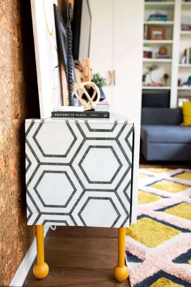
Due to the particular tile we picked and some of the small pieces it had, it would’ve been extremely difficult, if not impossible to to miter the edges at a 45 degree angle to have a true waterfall edge.  So we did the next best thing and made sure the pattern lined up.   

44.tiled.credenza.mustardrug.jpg

We used a black schluter strip in black to edge the tile and hide the cement backer board.

We bought legs from pretty pegs in a fun color.  We started with 4 legs, but with the weight of the tile, we needed to add 4 more legs in the middle so it didn’t sag in the middle.

Swatt_Co_Lowres-65.jpg

These legs were the 17” legs from pretty pegs, which we like the look of better, but it made the console a little too tall for the space, and a little more wobbly than we liked considering this was going to be used for kids toys, and we didn’t want the kids to yank a drawer open and topple it over on them. 

If this wasn’t being used by kids a lot, I would’ve felt comfortable keeping them as is.  But since it is being used for kids, and we sort of like our kids most of the time, we figured we didn’t want them to die in a freak furniture accident, so we cut the legs shorter.  (and by we, I mean my husband). 

40.styled.credenza.corkwall.michigan.interiordesign - Copy.jpg

If pretty pegs doesn’t have a color you like, paint them! They paint really easily!  We bought the first 4 in yellow ochre and then by the time we realized we needed 4 more, they weren’t selling yellow anymore, so I ordered some wood ones, and got a custom match at the paint shop and I can barely even tell which leg is which!

Swatt_Co_Lowres-78.jpg

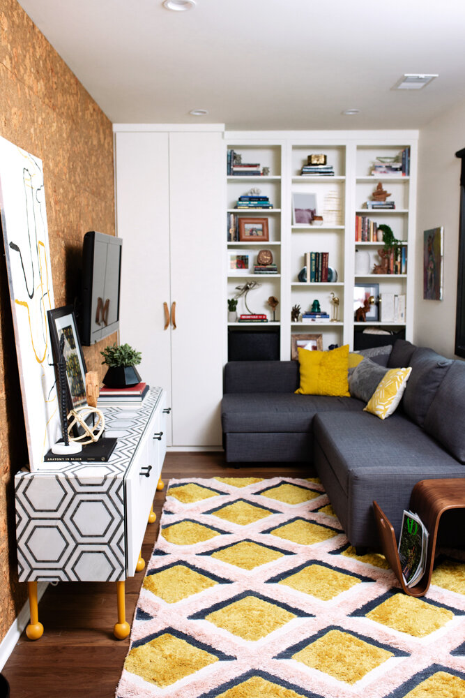
We moved it into our house and set pretty things on top and a bunch of ugly plastic toys inside and called it a day. 

If you have any questions, ask below in the comments!


Before & After of a Vintage-Modern Kitchen in Grand Rapids, Michigan


This was a project we finished last summer in the city of Grand Rapids.

The house was built in the early 1900’s and had been refinished (rather poorly might I add) by previous owners a few times to create a hodge podge of finishes. 

It still retained some of it’s amazing vintage charm and had so much potential. 

Before View- Keep an eye out for that brick pillar to get your bearings in the afters.

Before View- Keep an eye out for that brick pillar to get your bearings in the afters.

Multiple doors coming in and out

Multiple doors coming in and out

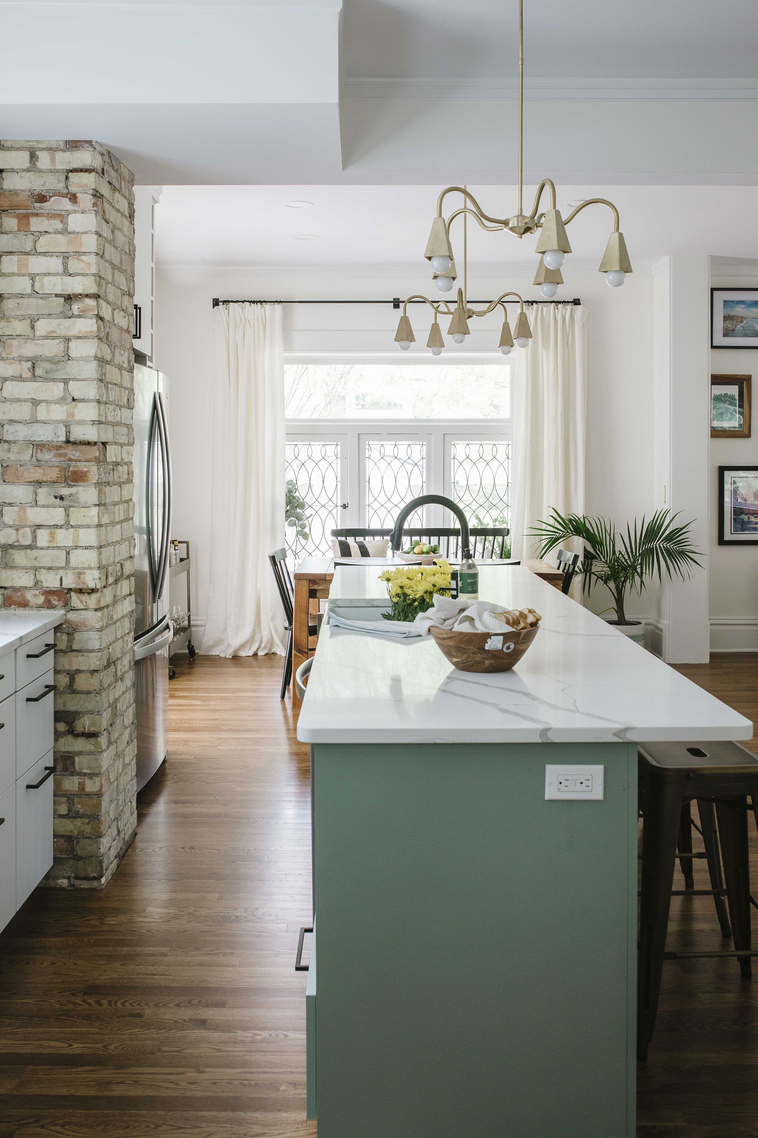
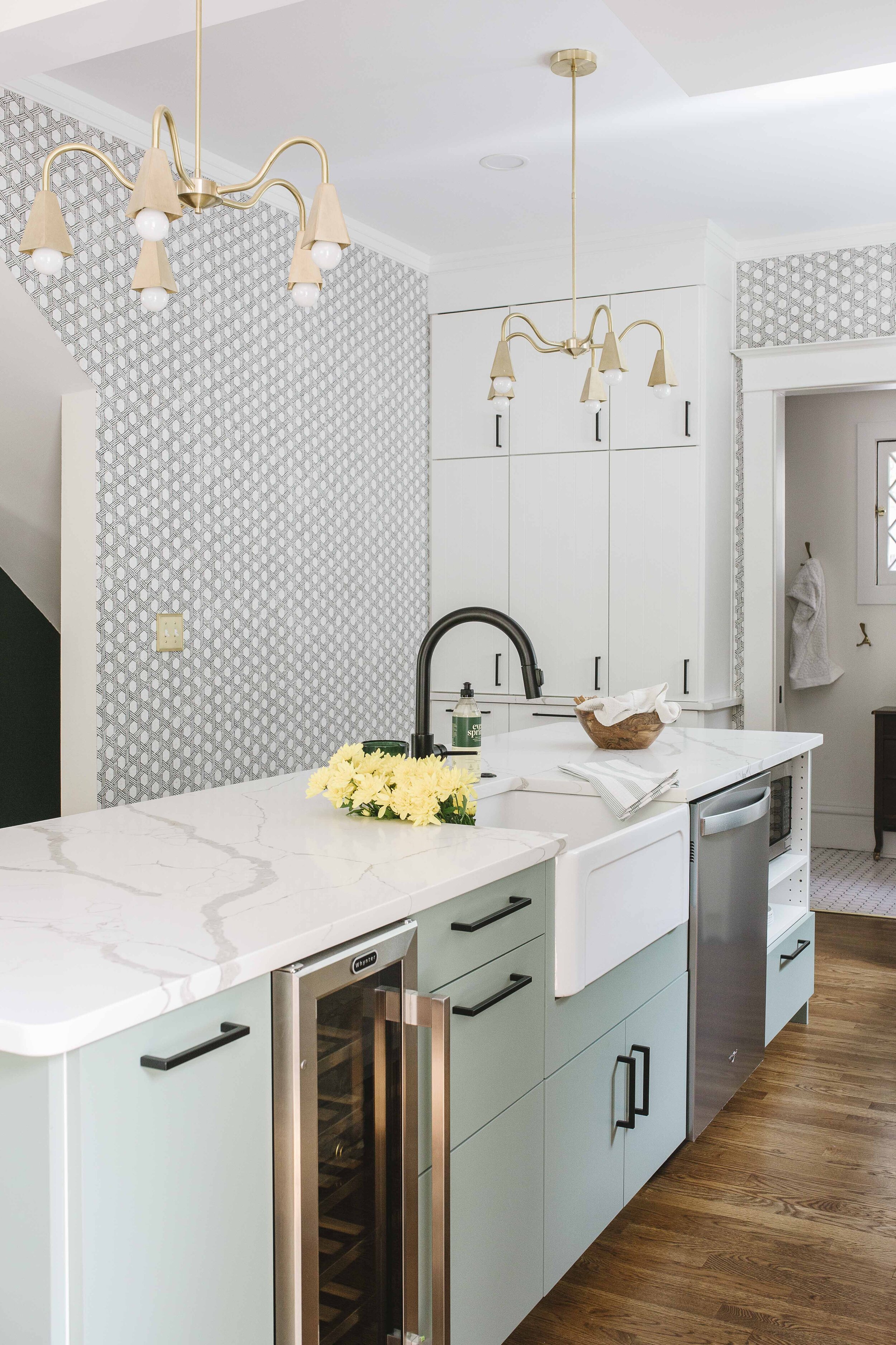
The owners really really wanted an island, and an open concept kitchen/living space.  It was pretty tricky, but by being creative and breaking a few kitchen design rules, we made it happen. 

Recognize that brick pillar??

Recognize that brick pillar??

The biggest rule we broke was the width of the kitchen walkway between island and stove.  A walkway in the kitchen should ideally be 48”, but 42” for smaller kitchens is perfectly acceptable and feels spacious.  In this kitchen, after discussing it extensively with our clients and warning them about the fact that it might feel cramped with more than one person in the area, we cut the walkway space down to 36”. 

36  light green kitchen island.jpg

They felt the trade off for being able to have an island was worth giving up that extra space for maneuvering. 

The other ‘sort of rule’ we broke was depth of the overhang.  We did a 9” overhang, which is the ABSOLUTE minimum overhang you should do if you want people to be able to sit comfortably.  14-15” is ideal in a perfect world, and we’ve done up to 18” overhangs in houses with tall people. (Imagine a tall persons knees on an airplane and then imagine them trying to sit at an island with a short overhang comfortably). 

33 open shelving subway tile kitchen backsplash wall sconce above range.jpg

We needed a range with a down draft vent, so we could put the range in front of the window.  While a window isn’t ideal for a range, it works -- I refuse to put a range in an island as it a complete and utter safety hazard and if people had ever taken care of kids with grease and hot water burns, they would never do it either.  Off soapbox.

50 white kitchen floor to ceiling cabinets old door semihandmade kitchen cabinets. ikea kitchen.jpg

We did cupboards all the way up to the ceiling and an appliance garage to the left of the stove. 

Overall, we (and more importantly, our clients) are super happy with the way it turned out and the way it functions.  Beautiful kitchens are always great, but if they don’t function well…well, ain’t no one got time for that. 

23 Modern Vintage Kitchen Modern farmhouse Sage Green kitchen Island Wallpaper in kitchen.jpg

In a few weeks we’ll be sharing all of our sources for this kitchen, so keep your eyes open! 


6 Spaces Using Sherwin Williams Tricorn Black


6 Spaces Using Sherwin Williams Tricorn Black

At the end of the day in our family, we try to talk about our Best & Worst things that happened to us, and a kind thing we did.

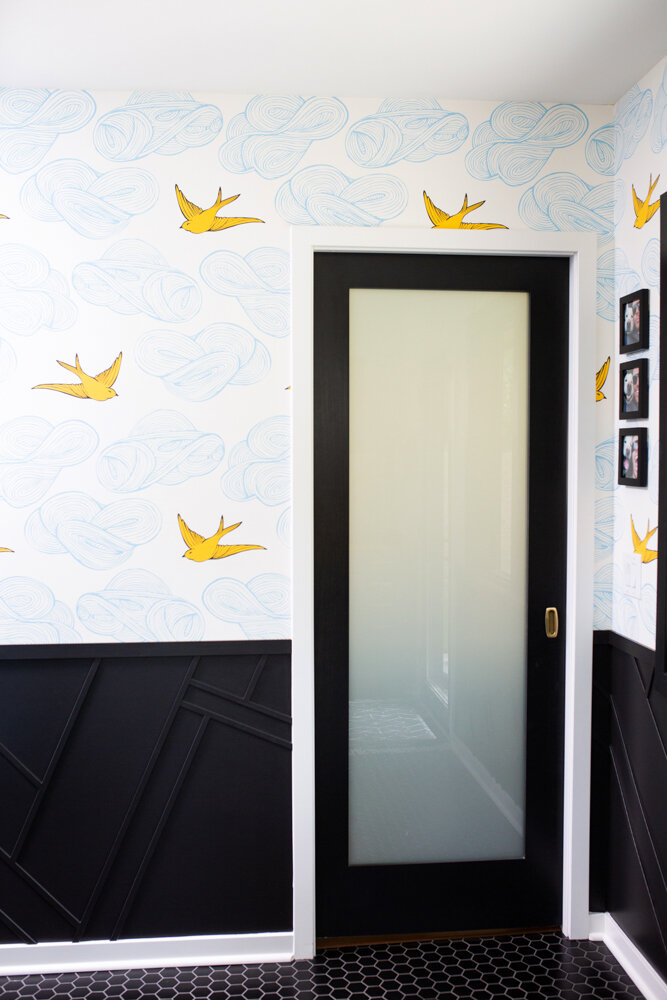
Tricorn black in BM Pearl on wall and Semigloss on door.

Tricorn black in BM Pearl on wall and Semigloss on door.

Sharing all these pics is my kind thing for the day.  And I can tell you right now, if you’re searching for the perfect black paint color, this is the best thing of your day.

I can say that because now you don’t have to get 10+ black paint samples in search of the ONE TRUE BLACK that will go in almost any situation.

You’re Welcome.

Tricorn Black on Door in semigloss. Of course there are marks on the door…insert eye roll…

Tricorn Black on Door in semigloss. Of course there are marks on the door…insert eye roll…

Raise your hands if you ever search for a paint color on pinterest only to be directed to a link that has nothing to do with the paint color you want to see in real life rooms?  Yeah, it sucks. 

So instead of making you read a thousand words before I show you any more pics, see all the areas we’ve used Sherwin Williams Tricorn black. 

Tricorn Black in Matte on Ceiling

Tricorn Black in Matte on Ceiling

We used a lot of black in this house, and this color worked in EVERY single spot.  That’s hard for one single color to do….I just gave the color Tricorn Black a lot to carry on it’s small shoulders, but I know it’s up to the job.    

I will continue to use this color everywhere. 

Tricorn black semigloss next to Hygge & West Pattern People Wallpaper

Tricorn black semigloss next to Hygge & West Pattern People Wallpaper

If you’re wondering about different sheens, the window trim and doors are all painted in semi gloss, the bathroom ceiling is in a flat/matte sheen, and the black geometric half wall is in Benjamin moore “Pearl”.  YES! You can get Sherwin Williams paint colors mixed up in Benjamin moore sheens (and vice versa).  Peral is this GREAT sheen that is a mix between satin and eggshell.  It is less shiny than satin, but moreso than eggshell, so it possesses a greater cleanability.  It’s amazing actually. 

Tricorn black in semigloss against Newberg Green Walls in Flat

Tricorn black in semigloss against Newberg Green Walls in Flat

Tricorn black in semigloss against OC 130 Cloud white

Tricorn black in semigloss against OC 130 Cloud white

And that’s it folks! Go buy yourself some paint!